Best Interior Paint Colours for Indian Homes in 2026
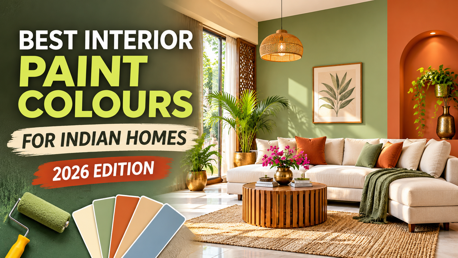
Best Interior Paint Colours for Indian Homes in 2026
Choosing the right interior paint colours can completely change the appearance of an Indian home. A suitable wall shade can make a living room feel more welcoming, give a bedroom a softer atmosphere, and help a compact apartment look visually open. However, selecting colours is not always easy because every home has different lighting, furniture, flooring, room sizes, and personal preferences.
In 2026, homeowners have plenty of options beyond traditional white and cream walls. Warm beige, muted green, earthy brown, soft blue, greige, and subtle pastel shades offer different ways to create attractive interiors. Some colours work beautifully across an entire room, while others are more effective when used on a single feature wall.
The important thing is to choose colours that suit the actual space rather than simply copying a combination from an online photograph. A shade that looks beautiful in a brightly lit showroom may appear completely different in a bedroom with limited sunlight.
This guide explains popular interior colour ideas, room-by-room combinations, and practical points to consider before purchasing paint for your home.
Why Choosing the Right Interior Paint Colours Matters
Wall paint is one of the most noticeable elements in a home's interior. It covers large surfaces and influences how furniture, curtains, flooring, lighting, and decorations look together.
A well-planned colour scheme can make an interior feel coordinated without requiring expensive changes to existing furniture.
1. It Creates the Overall Appearance of a Room
Different shades produce different visual impressions. Warm colours can give a room a cosy appearance, while cooler shades may create a cleaner and more understated look.
For example, warm white and beige can complement traditional wooden furniture. Soft grey and muted blue may suit a contemporary interior with simple furniture and minimal decoration.
The best option depends on the appearance you want to create.
2. It Helps Coordinate Furniture and Flooring
Before selecting a wall colour, look at the items that will remain in the room.
Consider your:
- Sofa and chairs
- Bed and wardrobe
- Floor tiles or wooden flooring
- Curtains and blinds
- Doors and window frames
- Dining furniture
- Decorative lights and accessories
For example, if your living room has dark wooden furniture and cream flooring, warm beige or ivory may create a balanced combination. If the room contains grey furniture and black decorative details, a suitable light grey or greige may work better.
3. It Can Influence How Spacious a Room Appears
Light shades are often useful in smaller rooms because they create a brighter visual appearance. Dark colours can make a wall more noticeable and add depth, but using them everywhere may make a compact space feel enclosed.
A practical approach is to use a lighter shade for the main walls and introduce a deeper colour through one selected wall or decorative section.
4. It Gives Every Room Its Own Character
A home does not need to use exactly the same colour in every room. The living room, bedroom, kitchen, and study area have different purposes.
You can use a consistent base palette throughout the home while introducing different accent shades in individual spaces.
12 Best Interior Paint Colours for Indian Homes in 2026
The following shades offer ideas for different home styles, from traditional interiors to modern apartments. Always test the actual paint shade before applying it to a large wall.
1. Warm White
Warm white is a versatile option for homeowners who prefer a clean interior without making the walls look too stark.
Unlike some cooler whites, warm white shades have subtle cream or yellow undertones. They can work with wooden furniture, neutral curtains, colourful artwork, and different flooring styles.
Best suited for:
- Living rooms
- Bedrooms
- Hallways
- Dining areas
- Open-plan interiors
Suggested combinations:
- Warm white with natural wood
- Warm white with beige furniture
- Warm white with muted green accents
Practical tip: Compare several white samples under daylight and artificial lighting. A shade that looks neutral in the afternoon may appear warmer under yellow indoor lights.
2. Soft Beige
Soft beige is a popular choice for people who want a warm and comfortable-looking interior. It offers more colour than plain white while remaining easy to coordinate with furniture.
It works particularly well with wooden doors, brown sofas, cream flooring, and natural decorative materials.
Best suited for:
- Living rooms
- Bedrooms
- Dining spaces
- Entrance areas
Suggested combinations:
- Beige with ivory
- Beige with chocolate brown
- Beige with olive green
Practical tip: Check whether the beige has yellow, pink, or grey undertones. These small differences can affect how it looks beside your flooring and furniture.
3. Sage Green
Sage green is a muted shade that combines green with a soft grey appearance. It introduces a natural element without looking as bright as some traditional green paints.
This colour can work on all walls in a suitably lit room or as an accent behind a bed or sofa.
Best suited for:
- Bedrooms
- Reading corners
- Living room feature walls
- Study areas
Suggested combinations:
- Sage green with warm white
- Sage green with light wood
- Sage green with beige
Practical tip: If your room receives limited natural light, compare lighter sage shades before selecting a deeper version.
4. Light Grey
Light grey offers a simple and contemporary appearance. It can coordinate with white furniture, wooden flooring, black fixtures, and modern decorative accessories.
However, grey is not a single uniform colour. Some shades have blue undertones, while others contain warmer beige tones.
Best suited for:
- Modern living rooms
- Bedrooms
- Study rooms
- Hallways
Suggested combinations:
- Light grey with white
- Light grey with dusty blue
- Light grey with charcoal accents
Practical tip: Avoid selecting a grey shade only from a small online image. Test it in the actual room because lighting can change its appearance.
5. Cream
Cream is a softer alternative to bright white and works well in homes with traditional furniture and warm decorative details.
It can create a coordinated appearance when used with wooden cabinets, brown furniture, patterned curtains, and beige flooring.
Best suited for:
- Family rooms
- Bedrooms
- Living rooms
- Dining spaces
Suggested combinations:
- Cream with dark brown
- Cream with terracotta
- Cream with natural wood
Practical tip: Compare cream paint samples with your existing floor tiles. A strongly yellow cream may not look balanced beside cool grey flooring.
6. Dusty Blue
Dusty blue is a muted blue shade that adds colour without becoming overly bright. It can be a suitable option for homeowners who want something different from traditional neutral walls.
It works particularly well as a bedroom accent or in a study area with simple furniture.
Best suited for:
- Bedrooms
- Study rooms
- Reading areas
- Selected living room walls
Suggested combinations:
- Dusty blue with off-white
- Dusty blue with light grey
- Dusty blue with natural wood
Practical tip: Choose a lighter version for a small room and use darker dusty blue selectively if you want a stronger focal point.
7. Terracotta
Terracotta is an earthy shade inspired by natural clay. It brings warmth and can give an interior a distinctive appearance.
Instead of painting every wall in terracotta, consider using it behind a dining table, sofa, or decorative niche.
Best suited for:
- Dining rooms
- Living room feature walls
- Entrance areas
- Decorative sections
Suggested combinations:
- Terracotta with ivory
- Terracotta with beige
- Terracotta with dark brown
Practical tip: Muted terracotta is often easier to coordinate with neutral furniture than a highly saturated orange-based shade.
8. Olive Green
Olive green is deeper than sage green and offers an earthy appearance. It can look attractive with natural wood, beige upholstery, and warm decorative materials.
Because it is a deeper shade, consider using it selectively in smaller rooms.
Best suited for:
- Bedroom feature walls
- Living room accents
- Reading corners
- Dining spaces
Suggested combinations:
- Olive green with cream
- Olive green with sand beige
- Olive green with ivory
Practical tip: Check how much daylight enters the room before choosing a dark olive shade for a large wall.
9. Pale Yellow
Pale yellow introduces a gentle touch of colour while keeping the overall appearance light.
It can work in kitchens, dining areas, and rooms where you want a warmer alternative to white.
Best suited for:
- Kitchens
- Dining areas
- Children's rooms
- Entrance spaces
Suggested combinations:
- Pale yellow with white
- Pale yellow with cream
- Pale yellow with light grey
Practical tip: Select a soft yellow rather than a bright shade if you want the walls to coordinate easily with existing furniture.
10. Lavender
Lavender is a soft purple shade that can give bedrooms and personal spaces a distinctive appearance.
It pairs well with light-coloured furniture and simple decorative elements.
Best suited for:
- Bedrooms
- Children's rooms
- Personal study areas
- Small feature walls
Suggested combinations:
- Lavender with white
- Lavender with pale grey
- Lavender with soft beige
Practical tip: Test lavender under different lighting conditions because some shades can appear more pink or blue depending on the light.
11. Greige
Greige combines the appearance of grey and beige. It is useful for homeowners who want a neutral colour that is neither too cool nor strongly warm.
It can work across different rooms and coordinate with many furniture styles.
Best suited for:
- Living rooms
- Bedrooms
- Hallways
- Dining areas
Suggested combinations:
- Greige with off-white
- Greige with dark brown
- Greige with wooden furniture
Practical tip: Compare greige samples with your furniture and flooring. Its undertone can become more noticeable when placed beside other neutral shades.
12. Muted Peach
Muted peach adds a gentle warmth to an interior. It offers an alternative to beige for homeowners who prefer a little more colour.
It can be used across a bedroom or as a smaller accent in a dining area.
Best suited for:
- Bedrooms
- Dining rooms
- Children's rooms
- Decorative sections
Suggested combinations:
- Peach with cream
- Peach with ivory
- Peach with soft grey
Practical tip: Choose a subtle peach if the room already contains colourful curtains, patterned furniture, or decorative accessories.
Quick Comparison of Interior Paint Colours
| Paint colour | General appearance | Suitable spaces |
|---|---|---|
| Warm white | Clean and flexible | Living room, bedroom |
| Soft beige | Warm and welcoming | Living room, dining room |
| Sage green | Natural and subtle | Bedroom, study |
| Light grey | Modern and simple | Living room, hallway |
| Cream | Soft and traditional | Bedroom, family room |
| Dusty blue | Muted and gentle | Bedroom, study |
| Terracotta | Earthy and warm | Dining room, feature wall |
| Olive green | Deep and natural | Bedroom, living room |
| Pale yellow | Light and cheerful | Kitchen, dining room |
| Lavender | Soft and distinctive | Bedroom |
| Greige | Balanced and neutral | Living room, bedroom |
| Muted peach | Warm and gentle | Bedroom, dining room |
How to Select Paint Colours for Different Rooms
Choosing one colour for the entire house may seem convenient, but a room-by-room approach can produce a more coordinated result.
Living Room Colour Ideas
The living room usually contains several large visual elements, such as a sofa, television unit, curtains, and flooring. Start by checking the colours of these items before selecting the wall paint.
Some combinations to consider include:
- Warm white with beige accents
- Greige with off-white
- Cream with muted terracotta
- Light grey with dusty blue
- Soft beige with olive green
If you have a large dark-coloured sofa, a lighter wall shade can help create contrast.
Bedroom Colour Ideas
Bedroom colours should suit your personal taste and the furniture already present in the room.
Some useful combinations include:
- Sage green with ivory
- Dusty blue with warm white
- Soft beige with cream
- Lavender with pale grey
- Muted peach with off-white
A feature wall behind the bed can introduce a deeper colour without making the entire room feel visually heavy.
Kitchen Colour Ideas
Kitchen wall colours should coordinate with cabinets, countertops, tiles, and flooring.
Consider:
- Cream with white
- Pale yellow with light grey
- Warm white with beige
- Greige with off-white
Also check whether the paint product is suitable for the surface and cleaning conditions of your kitchen.
Dining Room Colour Ideas
The dining area can use warm colours that connect the furniture with the surrounding spaces.
Some combinations include cream with terracotta, beige with olive green, and warm white with muted peach.
For an open-plan living and dining area, keep at least one colour consistent between the two spaces to maintain visual continuity.
Study Room Colour Ideas
A study room should have a colour scheme that works with its desk, shelves, lighting, and available space.
Light grey with white, sage green with cream, and dusty blue with off-white are combinations worth considering.
Before making a final decision, check the shade in the actual room rather than relying only on a sample photograph.
Final Thoughts
The right wall shade is not necessarily the brightest or most fashionable colour. It is the one that works with your home's lighting, room size, furniture, flooring, and everyday needs.
Start with two or three suitable options, compare physical samples, and observe how they look at different times of the day. A little planning before painting can help avoid costly colour changes later.
How to Create Beautiful Interior Paint Colour Combinations
Choosing a single wall colour is only one part of interior design. The final appearance depends on how that shade works with the other colours and materials in the room.
A good colour combination should look balanced rather than making every wall, piece of furniture, and decorative item compete for attention.
Here are some practical combinations worth considering for Indian homes.
1. Beige and White
Beige and white create a simple combination that can suit both traditional and contemporary interiors.
Use warm beige on the main walls and white on the ceiling, doors, or selected decorative sections. Wooden furniture and neutral curtains can complete the look.
Suitable for: Living rooms, bedrooms, and dining areas.
2. Sage Green and Cream
Sage green adds a natural element, while cream keeps the combination soft and balanced.
You can use sage green behind the bed or sofa and cream on the remaining walls. Light wooden furniture and simple curtains can complement this palette.
Suitable for: Bedrooms, reading corners, and living rooms.
3. Grey and Dusty Blue
Grey and dusty blue can work well in contemporary interiors. The grey provides a neutral background, while blue introduces a little more character.
For a balanced appearance, use light grey on the main walls and dusty blue on one selected wall.
Suitable for: Bedrooms, study rooms, and modern living spaces.
4. Terracotta and Ivory
Terracotta brings an earthy warmth to an interior. Ivory can soften its appearance and prevent the colour from dominating the room.
This combination can look attractive with wooden furniture, natural fabrics, and simple decorative accessories.
Suitable for: Dining areas, living room feature walls, and entrance spaces.
5. Olive Green and Sand Beige
Olive green offers depth, while sand beige provides a lighter background.
Consider using olive green on a feature wall and beige across the remaining walls. This can create contrast without requiring several unrelated colours.
Suitable for: Larger bedrooms, living rooms, and reading areas.
6. Peach and Off-White
Muted peach and off-white create a gentle combination that can suit personal spaces.
Peach can be used on the main wall or behind the bed, while off-white keeps the rest of the room visually simple.
Suitable for: Bedrooms, children's rooms, and smaller decorative sections.
Interior Colour Combination Comparison
| Combination | Overall style | Suggested use |
|---|---|---|
| Beige and white | Warm and timeless | Living room |
| Sage green and cream | Natural and relaxed | Bedroom |
| Grey and dusty blue | Contemporary | Study or bedroom |
| Terracotta and ivory | Earthy and expressive | Dining area |
| Olive green and beige | Rich and balanced | Living room |
| Peach and off-white | Soft and gentle | Bedroom |
How to Choose Interior Paint Colours for Small Indian Homes
Many Indian apartments have compact bedrooms, narrow passages, and living rooms that serve multiple purposes. Selecting suitable colours can help these spaces feel more open and coordinated.
However, light paint alone cannot solve every space-related problem. Furniture size, storage arrangements, ceiling height, window placement, and lighting also matter.
Use Light Shades as the Main Wall Colour
Consider warm white, ivory, pale beige, or light greige for the main walls.
These shades can create a brighter appearance, especially when the room receives adequate natural or artificial light.
Avoid Using Too Many Strong Colours
A small room can look visually busy when several contrasting shades appear on different walls.
Choose one main colour and one or two supporting shades. Introduce stronger colours through cushions, artwork, furniture, or a carefully selected accent wall.
Keep the Ceiling Visually Connected
A light ceiling colour can help maintain a continuous appearance between the walls and ceiling.
White, warm white, or a very pale version of the wall colour can be considered.
Use Dark Colours Selectively
Dark green, charcoal, navy blue, and deep brown can add character, but they should be planned carefully in compact spaces.
Instead of covering every wall, use a darker shade behind a bed, sofa, or television unit.
How Lighting Changes Interior Paint Colours
Lighting is one of the most important factors when selecting wall paint. The same shade can appear different in two rooms, even when the paint comes from the same container.
A colour viewed under a shop's artificial lighting may not look identical when applied to a wall at home.
Natural Daylight
Natural light changes throughout the day.
A wall receiving direct morning sunlight may look brighter than the same wall in the evening. Rooms facing different directions can also have different lighting conditions.
Before purchasing a large quantity of paint, observe your shortlisted colours in the actual room.
Warm LED Lighting
Warm lighting can make beige, cream, peach, and terracotta shades appear warmer.
It can also change how neutral colours look, so consider your existing ceiling lights and lamps when selecting paint.
Cool White Lighting
Cool white lighting may make blue, green, and certain grey shades appear more noticeable.
If you use cool white lights in your study room or kitchen, check the paint samples under those lights before finalising the colour.
Test Colours Before Painting the Entire Room
Do not rely only on online photographs or small printed shade cards.
Follow this simple process:
- Shortlist two or three colours.
- Obtain physical samples from the paint manufacturer or dealer.
- Apply each sample to a suitable section of the wall.
- Observe the samples in daylight.
- Check them again under your regular evening lights.
- Compare them with the furniture, flooring, and curtains.
- Select the shade that looks suitable under your normal living conditions.
For additional guidance, read Asian Paints' guide to testing paint colours before buying.
This small step can help prevent disappointment after the full room has been painted.
How to Match Wall Paint with Furniture and Flooring
The wall colour should not be selected independently from the rest of the interior. Furniture and flooring often remain in place for years, so they should be part of the colour decision.
Matching Paint with Wooden Furniture
Wooden furniture is common in Indian homes, from traditional teak beds to modern engineered-wood wardrobes.
The wood's undertone can influence which wall colours look balanced beside it.
| Furniture appearance | Wall colours to consider |
|---|---|
| Dark brown wood | Cream, ivory, sage green |
| Light natural wood | Warm white, beige, pale grey |
| Reddish-brown wood | Soft beige, muted peach, warm white |
| Walnut finish | Greige, cream, muted olive |
| White furniture | Sage green, dusty blue, light grey |
For example, a dark wooden bed can look well coordinated against warm white or soft beige walls. If the furniture is light oak, sage green or pale grey may create a different but equally attractive appearance.
Matching Paint with Floor Tiles
Flooring is another important part of the colour scheme.
- Cream or beige tiles can work with warm white, soft beige, and terracotta accents.
- Grey tiles can complement greige, light grey, and muted blue.
- White marble-look flooring can work with sage green, ivory, and pale beige.
- Dark flooring can be balanced with lighter wall shades.
Always compare the actual materials rather than relying on colour names alone.
Matching Paint with Curtains and Sofas
Curtains and sofas occupy noticeable areas in many living rooms. If they already have bold patterns or strong colours, simpler walls may produce a more balanced result.
For example, a navy blue sofa can work with light grey, warm white, or beige walls. A patterned sofa may look better against a relatively simple background.
Choosing the Right Paint Finish for Interior Walls
Colour is only one part of the selection process. The paint finish also affects how the wall looks and how it can be maintained.
Different finishes reflect light differently and may have different cleaning and durability characteristics depending on the product.
| Finish | General appearance | Where it may be suitable |
|---|---|---|
| Matte | Low shine and subtle | Bedrooms, living rooms |
| Satin | Soft, gentle sheen | Family areas |
| Semi-gloss | Noticeable reflection | Selected doors and trims |
| Gloss | Highly reflective | Suitable decorative surfaces |
Matte Finish
Matte paint has a low-reflection appearance. It can give walls a smooth, understated look and is often considered for bedrooms and living rooms.
Its cleanability and stain resistance depend on the particular product formulation, so check the manufacturer's specifications.
Satin Finish
Satin offers a gentle sheen between matte and more reflective finishes.
It may be considered for spaces where homeowners want some light reflection without a highly glossy appearance.
Semi-Gloss and Gloss Finishes
More reflective finishes can be useful for selected trims, doors, and other suitable surfaces.
However, reflection can make surface imperfections more noticeable. Proper preparation is important before application.
If you want to understand these options in more detail, read Zorvanta's related guide: How to Choose the Right Interior Paint Finish.
Common Mistakes to Avoid When Selecting Interior Paint Colours
Even an attractive shade can produce a disappointing result when the colour is selected without considering the room.
Here are some mistakes worth avoiding.
1. Selecting Paint Only from an Online Photograph
A photograph cannot show exactly how a paint shade will appear in your home.
Screen brightness, image editing, camera settings, and lighting can all affect the displayed colour.
Better approach: Use online images for inspiration, then check physical samples.
2. Ignoring Existing Furniture
Choosing wall paint before considering furniture can create an unexpected mismatch.
Better approach: Keep a photograph or sample of your flooring, curtains, and furniture when visiting a paint store.
3. Using Too Many Colours in One Room
Several unrelated wall colours can make a room look visually crowded.
Better approach: Select a main shade, a supporting shade, and a limited accent colour.
4. Choosing Dark Colours Without Checking Lighting
Deep shades can look attractive in large, well-lit rooms but may feel too heavy in a compact space.
Better approach: Test dark shades on a smaller wall section before using them extensively.
5. Forgetting About the Ceiling
Walls, ceilings, and trims should work together.
Better approach: Plan the ceiling colour at the same time as the main wall colours.
6. Not Checking the Paint Finish
A shade can look different depending on whether the finish is matte, satin, or glossy.
Better approach: Compare the colour and finish together before ordering paint.
7. Painting Over Damaged Walls Without Preparation
Peeling paint, damp patches, cracks, and loose plaster should not simply be covered with a fresh coat.
Better approach: Identify and repair the underlying problem, prepare the surface, and follow the paint manufacturer's application instructions.
Practical Example: Selecting Colours for a 2BHK Indian Apartment
Imagine a 2BHK apartment with a living room, two bedrooms, a kitchen, and a small passage.
Instead of selecting a different strong colour for every room, the homeowner can create a connected palette.
| Area | Main wall colour | Supporting colour |
|---|---|---|
| Living room | Warm beige | Terracotta accent |
| Master bedroom | Sage green | Warm white |
| Second bedroom | Dusty blue | Off-white |
| Kitchen | Cream | Pale yellow accents |
| Passage | Warm white | Light beige |
This approach gives each space its own identity while keeping the overall interior coordinated.
The final choice should still depend on actual lighting, furniture, room dimensions, and the homeowner's preferences.
How to Estimate the Paint Required for Interior Walls
Selecting the right colour is important, but purchasing the correct amount of paint is also part of planning a painting project.
Buying too little paint can interrupt the work, while buying too much may leave unnecessary leftover material.
A basic estimate begins with the wall area.
Step 1: Calculate the wall area
For a simple rectangular room:
Wall area = Room perimeter × Wall height
Step 2: Subtract large openings
Subtract the approximate area of doors and windows when making a basic estimate.
Step 3: Check the paint coverage
Paint coverage varies by product, surface condition, application method, and number of coats. Use the coverage information provided by the manufacturer rather than assuming every paint has the same coverage.
Step 4: Consider the number of coats
The required quantity depends on the existing wall colour, surface condition, primer requirements, and the recommended application system.
Example:
Suppose a room measures 12 feet by 10 feet, with a wall height of 10 feet.
Perimeter = 2 × (12 + 10) = 44 feet.
Approximate wall area = 44 × 10 = 440 square feet.
This is the gross wall area before subtracting doors and windows. The final paint quantity should be calculated using the selected product's coverage rate and recommended coats.
For an accurate estimate, ask the paint supplier or professional painter to inspect the actual surface.
Final Checklist Before Buying Interior Paint
Use this checklist before placing your paint order:
- Confirm the colour scheme for each room.
- Check existing furniture and flooring.
- Compare physical colour samples.
- Observe samples in daylight and artificial light.
- Select an appropriate paint finish.
- Inspect walls for cracks, dampness, and peeling.
- Confirm primer and surface preparation requirements.
- Check the manufacturer's coverage information.
- Calculate the approximate quantity required.
- Keep the paint shade and product details for future touch-ups.
For product or project-related guidance, you can also contact the Zorvanta Paints team.
Conclusion
Selecting interior paint colours is easier when you consider the complete room rather than focusing on the wall shade alone. Furniture, flooring, lighting, room size, and paint finish all contribute to the final appearance.
Warm white, beige, sage green, dusty blue, terracotta, olive green, and greige offer different possibilities for Indian homes. The best combination is the one that suits your space and remains comfortable for everyday living.
Take time to compare physical samples, check them under your regular lighting, and plan the colours room by room. A thoughtful selection can help create an interior that looks coordinated and reflects your personal style.
Final Tips for Choosing Interior Paint Colours
Choosing a wall colour becomes easier when you consider the room as a complete space rather than looking at a paint shade in isolation. Wall colours should work with your furniture, flooring, curtains, lighting and the amount of natural light entering the room.
Before finalising your colours, keep these practical points in mind:
- Choose a main colour first: Select one dominant shade for most walls, then add one or two complementary colours.
- Keep connected spaces coordinated: If your living room and dining area are open to each other, use shades that look balanced when viewed together.
- Use darker colours selectively: Deep green, terracotta and navy can add character, but using them on every wall may make a small room feel visually heavy.
- Consider maintenance: Light shades can make rooms feel open, but high-use areas may need washable paint finishes.
- Check the colour in your own lighting: A shade can look different in daylight, warm artificial light and evening conditions.
A simple colour plan can prevent unnecessary repainting and help create a consistent appearance throughout your home.
Frequently Asked Questions About Interior Paint Colours
1. Which interior paint colours are best for Indian homes in 2026?
Warm white, beige, greige, sage green, muted peach, dusty blue and soft terracotta are useful choices for Indian homes. The best shade depends on room size, lighting, furniture and personal preference.
2. Which wall colour makes a small room look bigger?
Warm white, cream, pale beige and light greige can make a small room feel more open. Using a similar light shade on the walls and ceiling can also create a more continuous appearance.
3. What is the best colour for an Indian living room?
Warm beige, ivory, greige and soft sage green are versatile living room options. They work with many common furniture and flooring styles and can be paired with colourful cushions, rugs and curtains.
4. Which colour is suitable for a bedroom?
Soft sage green, dusty blue, warm white, lavender and muted peach can create a comfortable bedroom atmosphere. Choose a shade that feels pleasant under your bedroom lighting.
5. Is white paint a good choice for Indian homes?
Yes. White and off-white shades can make rooms feel brighter and provide a flexible background for different furniture styles. Warm white may feel softer than a very cool or stark white.
6. Which paint colour is best for a dark room?
Cream, warm white, pale beige and light greige are practical options for rooms with limited natural light. Test the shade under the artificial lighting you normally use before painting the entire room.
7. Can I use two different colours in one room?
Yes. You can use one main neutral shade and another complementary colour on an accent wall or selected architectural feature. Keep the combination balanced with the room's furniture and flooring.
8. Which interior paint colours are easiest to match with wooden furniture?
Warm white, beige, cream, greige and muted sage green generally pair well with wooden furniture. The exact combination depends on whether the wood has a light, reddish, golden or dark brown tone.
9. Should every room in a house have the same wall colour?
No. Different rooms can have different colours according to their purpose and lighting. However, choosing shades from a coordinated colour palette helps maintain a consistent look throughout the home.
10. How can I check an interior paint colour before buying it?
Apply a sample patch to the wall and observe it at different times of the day. Check it under natural daylight and your regular indoor lighting. Also compare it with your flooring, furniture and curtains before making the final decision.
Give Your Home a Fresh Interior Look with the Right Paint
The right interior paint colours can make an ordinary room feel more welcoming, comfortable and visually balanced. Whether you prefer warm neutral walls, refreshing green shades or a little terracotta character, choose colours that suit your home's lighting and everyday use.
Avoid selecting a shade only because it looks attractive in a catalogue or on a screen. Test it in your actual room, compare it with your existing interiors and choose a suitable paint finish.
Planning an interior painting project? Visit Zorvanta Paints & Coatings to get in touch and discuss your painting requirements.
Frequently Asked Questions
Need help choosing the right finish?
Talk to our team or request a tailored quotation for your project.