Modern House Exterior Paint Colour Combinations for 2026
Introduction
Choosing the right exterior paint colours can change the entire appearance of a house. A simple building can look elegant with a well-planned colour scheme, while an expensive home may look unbalanced if its exterior colours do not complement its architecture.
The best modern house exterior paint colour combinations balance appearance, practicality, and the surrounding environment. The colours should complement the building's shape, highlight architectural features, and work well with elements such as doors, windows, balconies, boundary walls, and outdoor flooring.
For Indian homeowners, choosing exterior colours requires a little extra planning. Strong sunlight, dust, seasonal rain, humidity, and local surroundings can influence how a painted surface looks over time. A colour that looks attractive on a small sample may appear quite different when applied across a large exterior wall.
In 2026, homeowners can consider a range of styles, from warm white and beige to sage green, earthy brown, charcoal grey, and muted terracotta. Rather than selecting colours simply because they are popular, it is better to choose a combination that suits the house and remains attractive for years.
This guide covers practical exterior paint colour combinations, explains how to use different shades, and helps you select a colour scheme for your home.
Why Exterior Paint Colour Combinations Matter
Exterior paint is one of the first things people notice about a house. It contributes to the property's overall appearance and helps create a consistent design.
However, selecting exterior colours involves more than choosing a favourite shade.
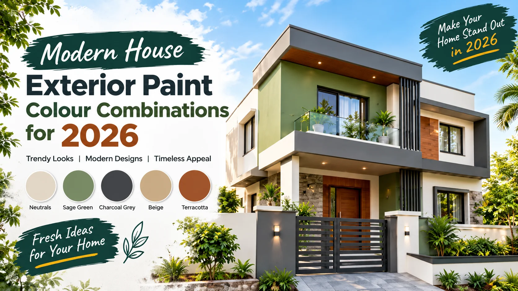
1. They improve the appearance of your home
A coordinated colour scheme can make a building look more organised and visually appealing.
For example, warm white walls combined with charcoal grey window frames create a clean, contemporary appearance. Beige walls with brown accents can produce a softer, more traditional look.
The goal is to choose colours that work together instead of competing for attention.
2. They highlight architectural features
Most houses contain features that can be emphasised through colour, including:
- Main entrances and door frames
- Balcony walls and railings
- Columns and pillars
- Window borders
- Front elevation projections
- Boundary walls
- Decorative exterior panels
Using a darker shade on a selected architectural feature can create contrast. A lighter main wall colour can help the darker details stand out.
For example, a house with a simple rectangular elevation may benefit from an off-white base with charcoal accents around selected windows and balconies.
3. They influence the visual size of a house
Light and dark colours can affect how people perceive a building's proportions.
Light shades often make exterior walls appear more open and spacious. Darker colours can visually emphasise particular sections, making them appear more prominent.
For a small independent house, using a light base colour with limited darker accents can create a balanced appearance.
For a large bungalow, a combination of beige, olive green, and dark brown may help divide the facade into visually distinct sections.
These effects depend on lighting, architecture, and the proportions of each colour.
4. They contribute to the overall design
Exterior colours should coordinate with other visible materials.
Before choosing paint, consider:
- Roof tiles or terrace finishes
- Natural stone cladding
- Wooden doors
- Aluminium or uPVC windows
- Metal gates
- Balcony railings
- Driveway tiles
- Garden plants and landscaping
If your home already has brown stone cladding, adding a complementary cream or beige wall colour may produce a more cohesive result than introducing several unrelated shades.
How to Choose Modern House Exterior Paint Colours
Before looking at individual combinations, understand how to select a colour scheme that suits your building.
Step 1: Choose a main exterior colour
The main colour covers the largest portion of the house.
Popular options include:
- Warm white
- Ivory
- Cream
- Beige
- Greige
- Light grey
- Pale sand
- Muted sage green
For many homes, a restrained main colour provides a useful foundation for additional accents.
Warm white and cream can suit homes with traditional or contemporary architecture. Greige and light grey may complement modern buildings with clean lines. Beige and sand tones can work well with stone, wood, and earthy landscaping.
Choose a main shade based on the building's design, the surrounding environment, and your preferred appearance.
Step 2: Select a secondary colour
The secondary colour adds variation without overwhelming the main shade.
It can be applied to:
- Balcony sections
- Projected walls
- Entrance surrounds
- Decorative panels
- Selected columns
- Recessed architectural areas
For example, a warm white main colour can be paired with sage green on a balcony wall or charcoal grey on a selected facade section.
A useful approach is to decide which architectural features deserve attention before choosing the secondary shade.
Step 3: Add an accent colour carefully
An accent colour is usually applied to a smaller area.
Suitable locations include the main door, window frames, a feature wall, or selected decorative details.
Dark brown, charcoal grey, muted terracotta, and deep olive can provide contrast when used thoughtfully.
However, too many accent colours may make a facade look visually crowded. Start with two main colours and add a third only when it serves a clear design purpose.
Step 4: Test the colours outdoors
Never depend entirely on a colour displayed on a mobile phone or computer screen.
Screens, lighting, and image processing can change how colours appear.
Instead:
- Select a few suitable paint shades.
- Obtain physical colour samples.
- Apply sample patches to an exterior wall.
- Observe them in morning sunlight and afternoon light.
- Check their appearance in shade.
- Compare them with your windows, doors, tiles, and other fixed materials.
Allow the sample to dry according to the manufacturer's instructions before making your final decision.
Testing colours on the actual building is particularly useful when comparing similar shades of white, cream, beige, and grey.
10 Modern House Exterior Paint Colour Combinations for 2026
The following combinations offer different styles, from minimal contemporary designs to earthy and traditional appearances. Treat them as starting points and adjust the exact shades to suit your house.
1. Warm White and Charcoal Grey
Best for: Modern homes, contemporary villas, and minimalist architecture.
Warm white paired with charcoal grey creates a clear contrast without requiring several colours.
Use warm white as the primary wall colour. Apply charcoal grey to selected balcony sections, window surrounds, boundary walls, or architectural projections.
This combination can work particularly well on buildings with straight lines, large windows, and simple geometric shapes.
How to use it:
- Main walls: Warm white
- Selected facade sections: Charcoal grey
- Doors: Natural wood or dark brown
- Railings: Black or charcoal, where suitable
Practical tip: Avoid covering every wall with dark grey if you prefer a light, open appearance. Using charcoal on selected features usually creates a more controlled result.
2. Beige and Chocolate Brown
Best for: Independent houses, family homes, and buildings with traditional design elements.
Beige and chocolate brown create a warm, grounded exterior.
Beige works as the main colour, while chocolate brown can highlight entrance areas, columns, window borders, or selected facade sections.
The combination may suit homes with wooden doors, brown stone finishes, or earthy outdoor flooring.
How to use it:
- Main walls: Light beige
- Accent sections: Chocolate brown
- Doors: Medium or dark wood
- Boundary wall: Beige with limited brown detailing
Practical tip: Choose a lighter beige if the house receives limited direct sunlight. Test the brown shade outdoors because very dark tones may look more dominant across large surfaces.
3. Sage Green and Warm White
Best for: Contemporary homes, garden-facing houses, and nature-inspired designs.
Sage green is a muted green shade that can create a softer appearance than brighter greens.
Combined with warm white, it offers contrast without the sharp effect of black and white.
Use sage green on one or two prominent sections, such as a balcony wall, a projected volume, or an entrance feature. Keep the remaining walls warm white for balance.
How to use it:
- Main walls: Warm white
- Feature sections: Sage green
- Doors: Natural wood or muted brown
- Landscaping: Existing greenery that complements the facade
Practical tip: Sage green varies considerably between paint ranges. Compare grey-green, pale sage, and deeper olive-leaning options before choosing a shade.
4. Greige and Off-White
Best for: Minimalist homes, modern duplexes, and understated architectural designs.
Greige combines visual qualities associated with grey and beige. It can provide more warmth than a cool grey while appearing more restrained than a strong beige.
Pair it with off-white to create subtle contrast.
This combination is useful when you want a modern exterior without relying on strong or highly saturated colours.
How to use it:
- Main walls: Off-white
- Secondary sections: Greige
- Window frames: Dark grey or another compatible existing finish
- Entrance: Wood-toned detailing
Practical tip: Check the undertones of both colours. A yellowish off-white and a cool greige may not coordinate as well as two shades with compatible undertones.
5. Cream and Muted Terracotta
Best for: Traditional Indian houses, warm-climate architecture, and homes with earthy design details.
Cream and muted terracotta create a warm exterior inspired by natural clay and earth tones.
Cream can cover the main walls, while terracotta can highlight entrance surrounds, selected columns, or small decorative sections.
The combination may complement clay tiles, exposed brick, and natural stone.
How to use it:
- Main walls: Soft cream
- Accent sections: Muted terracotta
- Doors: Wood or dark brown
- Outdoor flooring: Existing earthy or neutral finishes
Practical tip: Avoid choosing an overly bright orange if you prefer a subtle appearance. A muted terracotta shade can provide warmth without dominating the facade.
6. Light Grey and Blue-Grey
Best for: Contemporary homes with modern windows, simple elevations, and restrained detailing.
Light grey and blue-grey create a cool, coordinated colour scheme.
Use light grey as the main colour and reserve blue-grey for selected panels or architectural sections. The result can be especially effective when the building has clean lines and a relatively simple facade.
How to use it:
- Main walls: Light grey
- Feature sections: Muted blue-grey
- Railings: Black or dark grey
- Doors: Natural wood or a compatible neutral shade
Practical tip: Grey colours can look noticeably different under direct sunlight and in shadow. Test the combination on the building before painting the entire exterior.
7. Olive Green and Sand Beige
Best for: Nature-inspired homes, houses with gardens, and properties featuring stone or wood.
Olive green offers a deeper, earthier appearance than sage green. Sand beige helps balance its visual weight.
Use sand beige for the main walls and olive green on selected architectural elements.
This pairing can complement natural materials, mature trees, and earthy landscaping.
How to use it:
- Main walls: Sand beige
- Accent sections: Muted olive green
- Doors: Medium brown
- Decorative finishes: Natural stone, where already suitable
Practical tip: Keep the olive green muted if you want a restrained contemporary appearance. A very dark olive may dominate a small facade when used over a large area.
8. White and Dusty Blue
Best for: Modern homes, coastal-inspired designs, and houses with bright outdoor surroundings.
White and dusty blue create a lighter colour scheme with a gentle touch of colour.
Dusty blue is generally less intense than a bright blue, making it easier to coordinate with white walls and neutral architectural details.
How to use it:
- Main walls: Warm white
- Accent sections: Dusty blue
- Doors: Natural wood or white, depending on the design
- Railings: White, black, or a compatible existing finish
Practical tip: If the building is surrounded by strong sunlight, test the blue shade carefully. A pale colour can appear brighter outdoors than it does on a small sample card.
9. Taupe and Dark Brown
Best for: Large houses, duplexes, and homes with stone or wood accents.
Taupe is a muted neutral that can sit between grey and brown, depending on the formulation.
Combined with dark brown, it produces a deeper and more traditional appearance than a white-and-grey palette.
Use taupe as the main colour and dark brown on selected sections rather than every architectural feature.
How to use it:
- Main walls: Light taupe
- Accent sections: Dark brown
- Entrance: Wood-toned door
- Boundary wall: Taupe with restrained brown detailing
Practical tip: Check that the taupe does not clash with existing floor tiles or stonework. Undertones become particularly noticeable when several neutral materials appear next to one another.
10. Ivory, Sage Green, and Charcoal Grey
Best for: Contemporary villas, larger independent houses, and modern front elevations.
This three-colour combination brings together a light base, a natural accent, and a dark architectural detail.
Ivory provides the main background. Sage green adds a softer secondary colour, while charcoal grey defines selected edges or features.
How to use it:
- Main walls: Ivory
- Secondary sections: Sage green
- Limited accents: Charcoal grey
- Doors: Natural wood or another compatible finish
Practical tip: Decide which colour should dominate before applying all three. Ivory should generally cover the largest area in this example, while charcoal is best reserved for selected details.
Quick Comparison: Which Exterior Colour Combination Should You Choose?
| Colour combination | Overall appearance | Suitable design |
|---|---|---|
| Warm white and charcoal grey | Clean and contemporary | Modern homes |
| Beige and chocolate brown | Warm and traditional | Independent houses |
| Sage green and warm white | Soft and natural | Garden-facing homes |
| Greige and off-white | Minimal and understated | Contemporary architecture |
| Cream and terracotta | Warm and earthy | Traditional or earthy designs |
| Light grey and blue-grey | Cool and modern | Minimalist homes |
| Olive green and sand beige | Natural and grounded | Homes with landscaping |
| White and dusty blue | Light and relaxed | Coastal-inspired designs |
| Taupe and dark brown | Rich and understated | Larger houses |
| Ivory, sage green, and charcoal | Layered and contemporary | Modern villas |
These are design suggestions rather than universal rules. The most suitable combination depends on the architecture, natural light, surrounding materials, and personal preference.
What to Consider Before Finalising Your Exterior Colours
Before purchasing paint, check a few practical details.
Your house's architectural style
A modern building with large windows may suit a restrained combination of white, grey, and wood tones. A house with traditional details may look more harmonious with cream, beige, brown, or terracotta.
The objective is not to follow a fixed rule but to create a colour scheme that complements the building.
Natural light and building orientation
A wall facing strong sunlight can appear different from a shaded wall, even when both use the same paint.
Observe the house at different times of day. If the building has deep balconies or large overhangs, test colours in both sunny and shaded areas.
Existing materials
Do not select colours in isolation. Compare your samples with the roof, windows, gate, tiles, and any stone or wood finishes that will remain unchanged.
Maintenance requirements
Exterior walls are exposed to dust, rain, sunlight, and other environmental conditions. The actual maintenance needs depend on the paint formulation, surface preparation, exposure, and quality of application.
Ask the paint manufacturer or applicator about suitable exterior products, preparation requirements, expected maintenance, and cleaning instructions.
A carefully selected colour scheme works best when it is supported by the correct paint system and proper surface preparation.
Modern House Exterior Paint Colour Combinations for 2026
How to Choose Exterior Paint Colours for Indian Weather
India has different climatic conditions, from hot and dry regions to areas with heavy monsoon rainfall and coastal humidity. When selecting exterior paint colours, consider both the appearance you want and the conditions your house faces.
Colour selection alone cannot prevent paint damage. The paint system, surface preparation, application quality, and maintenance also play important roles.
1. Exterior Colours for Hot and Sunny Areas
Homes exposed to strong sunlight may benefit from lighter exterior shades such as warm white, cream, pale beige, and light grey.
Lighter surfaces generally absorb less solar energy than otherwise comparable darker surfaces, although the actual temperature difference depends on the materials, surface properties, and conditions.
Colour combinations to consider:
- Warm white and beige
- Ivory and light grey
- Cream and muted terracotta
- Off-white and sage green
Practical tips:
- Test colours in direct sunlight before making a final decision.
- Choose an exterior paint product designed for the building's exposure.
- Follow the manufacturer's recommendations for surface preparation and application.
- Ask whether the selected coating is suitable for your wall material and local climate.
2. Exterior Colours for Rainy and Humid Areas
Rain and humidity can expose weaknesses in exterior walls, particularly where water enters through cracks, damaged joints, or poorly maintained surfaces.
Cream, greige, muted green, and medium neutral shades can all work visually in these environments. However, no colour should be treated as a substitute for suitable waterproofing, drainage, and exterior coating.
Colour combinations to consider:
- Greige and off-white
- Sage green and warm white
- Beige and chocolate brown
- Light grey and charcoal accents
Practical tips:
- Repair cracks and investigate water seepage before painting.
- Check that the wall is sufficiently dry before applying the selected coating.
- Use a compatible exterior primer and paint system.
- Follow the manufacturer's guidance on drying conditions and weather restrictions.
If a wall repeatedly develops damp patches, address the source of moisture instead of simply applying another coat of paint.
3. Exterior Colours for Dusty and Urban Areas
In dusty environments, very pale exterior walls may show dirt more visibly, particularly near roads, entrances, and exposed boundary walls.
Mid-tone neutrals can be practical options when you want a balanced appearance.
Colour combinations to consider:
- Beige and brown
- Greige and charcoal grey
- Sand beige and olive green
- Taupe and dark brown
Practical tips:
- Consider how much dust reaches the facade each day.
- Choose an exterior coating with cleaning and maintenance instructions suitable for your needs.
- Avoid assuming that a darker colour will always hide dirt; dust can remain visible on dark surfaces too.
- Pay attention to the wall's texture, because rough surfaces may retain more dirt than smoother ones.
4. Exterior Colours for Coastal Areas
Coastal buildings can experience humid air, wind-driven rain, and airborne salt. These conditions make product suitability and maintenance particularly important.
For appearance, you could consider warm white with dusty blue, cream with beige, or off-white with muted green.
Practical tips:
- Select an exterior coating recommended for the building's exposure.
- Check metal railings and other susceptible materials for corrosion.
- Follow manufacturer instructions for cleaning and maintenance.
- Inspect exposed walls and joints regularly for deterioration.
A good colour combination improves the appearance of the house, but the correct coating system helps address the environmental conditions.
How Many Colours Should You Use on a House Exterior?
Most homes do not need a large number of paint colours to look attractive. A simple palette can make the building easier to coordinate and maintain visually.
Two-colour exterior schemes
A two-colour scheme uses one main colour and one secondary colour.
Examples include:
- Warm white and charcoal grey
- Beige and chocolate brown
- Cream and terracotta
- Sage green and ivory
Advantages:
- Easier to coordinate with existing materials
- Suitable for many architectural styles
- Helps create a consistent appearance
- Makes colour selection more straightforward
Potential limitation: A two-colour scheme may need thoughtful placement to highlight architectural details on a complex facade.
Three-colour exterior schemes
A three-colour scheme generally includes a main colour, a secondary colour, and a limited accent.
For example, a modern house could use ivory for the main walls, sage green for selected facade sections, and charcoal grey for small architectural details.
Advantages:
- Offers more design flexibility
- Can highlight different parts of the building
- Helps coordinate walls, doors, and selected features
Potential limitation: Poorly balanced colours can make the facade look busy.
Which approach is better?
| Factor | Two-colour scheme | Three-colour scheme |
|---|---|---|
| Overall appearance | Simple and coordinated | More layered |
| Colour selection | Usually easier | Requires more planning |
| Architectural detailing | Highlights selected features | Allows more distinctions |
| Risk of visual clutter | Lower when well planned | Higher if accents are overused |
| Suitable approach | Main wall plus one accent | Main wall, secondary colour, limited accent |
For a small house, start with two colours. Add a third only if it serves a clear purpose, such as highlighting a balcony, entrance, or distinctive architectural feature.
Choosing Exterior Paint Finishes
Colour is only one part of exterior appearance. The paint finish affects how light reflects from the wall and how the surface looks after application.
Available finishes and their suitability vary by product, so check the technical information for the specific paint you plan to use.
Matte finish
Matte finishes generally have low light reflection and can produce a restrained appearance.
They may be suitable for:
- Minimalist facades
- Large exterior wall areas
- Designs with understated colours
Consideration: Cleaning performance and resistance to marks depend on the formulation. Do not assume that every matte exterior paint has the same durability or maintenance requirements.
Low-sheen finish
Low-sheen finishes provide some light reflection without the stronger shine associated with glossy coatings.
They may be worth considering when you want a balanced appearance for the main walls.
Consideration: Compare the manufacturer's finish descriptions and sample the product on your actual wall. Different brands may use different terminology.
Gloss or high-sheen finish
Glossy finishes reflect more light and may suit selected architectural details.
Possible applications include:
- Certain doors
- Decorative elements
- Compatible metalwork
- Other surfaces specifically suited to the product
Consideration: A glossy finish can emphasise surface irregularities. Make sure the product is designed for the material being painted.
Quick finish comparison
| Finish | Visual effect | What to check |
|---|---|---|
| Matte | Low reflection | Cleaning and surface suitability |
| Low sheen | Subtle reflection | Product-specific durability |
| Gloss or high sheen | Stronger reflection | Surface preparation and intended use |
Best practice: Select the paint finish according to the surface, appearance, exposure, and manufacturer's recommendations rather than choosing by colour alone.
How to Match Exterior Colours With Doors, Windows, and Tiles
A colour scheme should work with the materials that are already part of the house.
Changing the wall colour while ignoring the gate, windows, or floor tiles can produce a result that looks disconnected.
1. Wooden doors
Natural wood tones often work well with warm white, ivory, beige, sage green, and muted grey.
If your main entrance has a prominent wooden door, consider using a neutral wall colour that allows the wood to remain a visual feature.
2. Black or dark window frames
Black and charcoal frames can coordinate with white, greige, beige, and light grey walls.
For a modern facade, you might choose warm white as the main colour and charcoal only on selected architectural sections.
You do not necessarily need to paint every nearby wall dark to match dark window frames.
3. Stone cladding
Stone can contain several undertones, including grey, cream, brown, and beige.
Look closely at the dominant colours in the stone before selecting the paint.
For example:
- Grey stone may coordinate with off-white or greige.
- Beige stone may work with cream or sand beige.
- Brown stone may complement ivory or muted earth tones.
These are starting points, not fixed rules. Test the actual paint samples beside the stone.
4. Boundary walls and gates
The boundary wall and entrance gate are visible parts of the property's overall appearance.
You can use the main house colour on the boundary wall and reserve a secondary colour for the gate pillars or selected details.
Avoid introducing multiple unrelated colours across the house, boundary wall, and entrance.
Common Mistakes to Avoid When Choosing Exterior Paint Colours
Even attractive colours can produce disappointing results when they are selected or applied without sufficient planning.
Mistake 1: Choosing colours only from online photos
A photo may be affected by sunlight, shadows, camera settings, screen brightness, and image editing.
Better approach: Use online images for inspiration, then test physical paint samples on your house.
Mistake 2: Selecting too many colours
Using several strong colours can make a facade look fragmented.
Better approach: Begin with a main colour and one secondary shade. Add an accent only when it improves the design.
Mistake 3: Ignoring existing materials
A paint shade may look attractive by itself but clash with the roof, tiles, stone, or window frames.
Better approach: Compare samples beside all major materials that will remain unchanged.
Mistake 4: Choosing a colour without testing it outdoors
Indoor lighting and small colour cards do not always represent the appearance of a full exterior wall.
Better approach: Apply sample patches and examine them at different times of day.
Mistake 5: Ignoring surface preparation
Even a suitable paint colour can look poor when applied over a damaged or inadequately prepared surface.
Better approach: Ask the applicator to inspect the wall, identify cracks or loose paint, and follow the selected product's preparation instructions.
Mistake 6: Expecting paint alone to solve dampness
Painting over an active moisture problem may lead to peeling, blistering, or recurring stains.
Better approach: Identify and correct the moisture source before selecting the appropriate repair and coating system.
Mistake 7: Choosing colours without considering maintenance
Some surfaces show dust, marks, and staining more readily than others.
Better approach: Think about your location, exposure, access for cleaning, and willingness to maintain the exterior.
Mistake 8: Ignoring the manufacturer's instructions
Paint products can differ in primer requirements, application methods, drying times, and weather restrictions.
Better approach: Follow the product data sheet and use compatible materials throughout the painting system.
Practical Example: Planning a Modern Indian House Exterior
Imagine a two-storey independent house with a flat roof, black window frames, a wooden entrance door, and a small front garden.
The owner wants a modern appearance but does not want the building to look overly dark.
One possible colour plan is:
| Building element | Suggested colour | Purpose |
|---|---|---|
| Main exterior walls | Warm white | Creates a light visual base |
| Selected balcony section | Sage green | Adds a natural accent |
| Small architectural details | Charcoal grey | Creates controlled contrast |
| Main entrance door | Existing natural wood | Preserves a warm material |
| Boundary wall | Warm white with limited grey detailing | Connects the entrance to the house |
Why this scheme can work
Warm white covers the largest area, keeping the overall palette light. Sage green introduces colour without requiring a bright shade. Charcoal grey provides contrast on selected details, while the wooden entrance adds another natural material.
The scheme should still be tested against the actual roof, tiles, windows, and surroundings before painting.
How to adjust the scheme
If the house receives intense sunlight, compare several warm white samples to find one that looks appropriate in daylight.
If the garden is small or the facade is narrow, use sage green on a limited section rather than spreading it across every wall.
If the building already has substantial dark stonework, reduce the additional charcoal accents to avoid making the facade visually heavy.
This example illustrates a useful principle: the best exterior colour combination is one that suits the actual house, not just one that looks attractive in an inspiration photo.
Best Practices for a Better Exterior Painting Result
Use the following checklist before finalising your colour scheme.
- Study the facade: Identify the main wall areas and the architectural features you want to highlight.
- Choose a restrained palette: Start with two colours and add a third only when necessary.
- Inspect existing materials: Compare paint samples with windows, doors, tiles, stone, and metalwork.
- Test the colours: Apply sample patches and check them in different lighting conditions.
- Inspect the surface: Repair cracks, remove loose paint, and address moisture problems before painting.
- Select a suitable coating: Choose a product designed for the exterior surface and environmental exposure.
- Follow application instructions: Use compatible primers and coatings as recommended by the manufacturer.
- Plan maintenance: Keep the product details and colour references for future touch-ups.
- Review the whole property: Check the house, entrance, and boundary wall together before approving the final palette.
- Confirm the final shades: Record the paint names or codes so the same colours can be identified later.
How to Estimate Exterior Paint Requirements
Before arranging the painting work, estimate the surface area that needs to be painted.
A simple starting formula is:
Wall area = Wall length × Wall height
For a rectangular wall measuring 10 metres long and 3 metres high:
10 × 3 = 30 square metres.
If a wall contains large doors or windows, their areas can be deducted for a more accurate estimate.
However, the total quantity of paint also depends on:
- The number of coats required
- The product's stated coverage
- The wall's texture and porosity
- The condition of the existing surface
- Application method and wastage
Use the coverage information on the product packaging or technical data sheet. Do not assume that every exterior paint covers the same area per litre.
For a full house, a painting contractor can measure the surfaces and estimate the required quantity more accurately.
Where to Find More Exterior Colour Inspiration
Paint manufacturers may offer colour cards, sample tools, product guidance, and design inspiration.
You can begin with the official Asian Paints website to explore available colour resources and exterior paint products. Confirm the suitability and availability of a particular shade or coating with the manufacturer or local supplier.
When researching inspiration online, use images to compare design approaches rather than copying colours without testing them.
A useful way to narrow your options is to save three or four combinations, identify the main and accent colours in each, and compare physical samples on your own house.
Pros and Cons of Popular Exterior Colour Approaches
| Approach | Pros | Cons |
|---|---|---|
| Light neutral colours | Flexible and easy to coordinate with many materials | Dirt may be more visible in exposed locations |
| Dark accent colours | Highlight selected architectural details | Too much dark colour can dominate the facade |
| Earthy colours | Can complement wood, stone, and natural surroundings | Undertones may clash with existing materials |
| Muted greens and blues | Add colour without necessarily appearing overly bright | The final appearance can change significantly with lighting |
| Three-colour schemes | Offer additional design flexibility | Require more planning to avoid visual clutter |
No single approach is best for every property. The right choice depends on the building's design, local conditions, existing materials, and the appearance you want to achieve.
Modern House Exterior Paint Colour Combinations for 2026
Conclusion
Choosing the right exterior paint colours is an important part of creating a home that looks attractive, balanced, and well maintained. The right combination can highlight architectural details, complement existing materials, and give an ordinary facade a more distinctive appearance.
The best modern house exterior paint colour combinations for 2026 include warm white with charcoal grey, beige with chocolate brown, sage green with ivory, greige with off-white, and cream with muted terracotta. Each combination offers a different appearance, so the ideal choice depends on your home's architecture, natural lighting, surrounding environment, and personal preference.
For Indian homes, it is also important to consider sunlight, dust, monsoon rainfall, and humidity. Select an exterior paint product suited to your wall surface and local conditions. Prepare the surface correctly, address moisture problems before painting, and follow the manufacturer's application instructions.
Before committing to a colour, test a few samples directly on your exterior walls. Compare them in sunlight and shade, and check how they look beside your doors, windows, tiles, and other permanent materials.
Remember that you do not need many colours to create an impressive exterior. A well-planned two-colour combination can look just as attractive as a more elaborate scheme.
The best exterior colour scheme is one that complements your home, suits your surroundings, and remains practical for your maintenance needs.
Call to Action
Planning to repaint your house exterior in 2026?
Start by selecting three colour combinations that match your home's architectural style. Test physical samples on the exterior wall, compare them with existing materials, and choose the palette that looks balanced in both sunlight and shade.
Whether you prefer modern white and grey, natural beige and brown, or a refreshing green-and-ivory combination, thoughtful colour selection can help you achieve a more coordinated exterior.
Save this guide for your next painting project and share it with someone planning to repaint their home.
Frequently Asked Questions
Need help choosing the right finish?
Talk to our team or request a tailored quotation for your project.