Painting Your Home Office & Study Room: Colours, Finishes & Lighting Tips for Productivity in Indian Homes
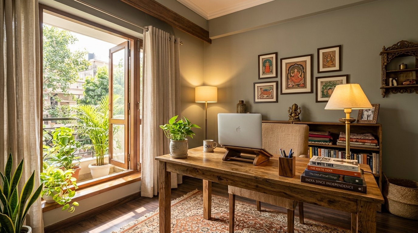
If you had asked an Indian interior designer five years ago which room in the house deserved the most considered paint specification, the answer would almost certainly have been the living room or the master bedroom. The home office — or the dedicated study room — would not even have made the list. These were rooms that happened: a corner of a spare bedroom, a table in the passageway, a desk pressed against a window in the kitchen. Rooms that were functional rather than designed, and certainly not spaces that warranted the same thought as the drawing room or the dining area.
That calculation has changed completely. Across Indian cities, the combination of work-from-home culture, competitive academic preparation, and the simple recognition that a well-designed workspace genuinely improves daily output has pushed the home office and study room to the front of the renovation priority list. Parents who would never have considered the study room's paint colour now understand that their child's environment during board exam preparation matters. Professionals who spent years working from makeshift table-and-chair arrangements have invested in proper home offices and know from experience that a well-designed space makes sustained concentration meaningfully easier.
What most of those investments still miss is the paint. The desk is chosen carefully. The chair is researched for ergonomics. The lighting is considered. And then the walls are painted the same contractor white that was there before, or hastily given a coat of whatever cream emulsion was left over. This guide corrects that gap — and explains why the walls of your study room or home office deserve as much care as everything else in the space.
How Wall Colour Actually Affects Concentration and Fatigue
The relationship between wall colour and cognitive performance is not a design myth. The visual environment you occupy during sustained intellectual work has a measurable effect on how long you can maintain focus before fatigue sets in, how easily you return to task after interruption, and how fatigued you feel at the end of a long session. Understanding the mechanism behind this relationship is the starting point for making an informed paint choice for a workspace.
The core principle is cognitive load. Every element in your visual field that demands attention — every high-contrast edge, every saturated colour patch, every pattern movement at the periphery — requires a small but real fraction of your brain's processing capacity. In a well-designed workspace, that capacity is reserved entirely for the work itself. In a poorly designed workspace, the visual environment continuously diverts small amounts of attention away from the task and toward the environment, contributing to fatigue without the person being aware of why they feel tired.
Colours that are highly saturated — vivid reds, bright yellows, electric blues — carry the highest cognitive load in a peripheral visual field. They demand attention, signal urgency or energy, and keep the sympathetic nervous system in a state of mild activation that is appropriate for short bursts of high-energy activity but counterproductive for the sustained, quiet concentration that study and desk work require. Conversely, colours that are very low in saturation — stark whites, flat greys — create a visual environment so undifferentiated that it can feel sterile, slightly dispiriting, and visually tiring in a different way: there is nothing for the eye to rest on, and the absence of any warmth or character makes the space feel like a waiting room rather than a purposeful place of work.
The sweet spot for a workspace is the middle ground: colours with enough warmth or interest to feel welcoming and purposeful, but with a saturation level low enough that they recede from conscious attention during work. Muted tones — soft sage greens, warm greys, dusty blues, calm terracotta in its quieter register — occupy this space correctly. They are present without being demanding, characterful without being distracting.
The Best Colour Families for Indian Home Offices and Study Rooms
Soft sage green and muted olive are consistently among the highest-performing colours for workspaces in Indian homes, and the reasons are both physiological and practical. Green is the colour associated most strongly with calm alertness — a mental state that supports sustained concentration without the flatness of excessive calm or the edge of stimulation. Soft sage, specifically, works beautifully in the Indian home context because it pairs naturally with the teak and mango wood furniture common in Indian interiors, holds its quality under both warm artificial lighting and the varied natural light of Indian windows, and has a low enough saturation that it recedes during work while providing a genuine sense of character and warmth when you look up from the screen. For a south- or east-facing study room with generous natural light, a muted sage or dusty olive is arguably the single best specification available.
Warm grey and greige — the family of grey tones that carry a warm beige or taupe undertone — are the most versatile choice for home offices in Indian apartments. They are neutral enough to work with any desk, shelving, or furniture configuration, sophisticated enough to look considered and professional in a video call background, and warm enough that they do not feel cold or clinical under the warm LED lighting that most Indian workspaces use. Warm grey works particularly well in smaller study rooms where a stronger colour might feel confining, and in rooms that face north and receive cool indirect light, where the warm undertone provides the balance that a cooler grey could not.
Dusty blue and slate are strong performers for study rooms used primarily for academic work or extended reading. These tones carry a quality of focused stillness that warm tones do not — they feel quieter and more concentrated, less socially warm. For a dedicated study space used by a student preparing for competitive examinations, a dusty blue or soft slate can provide exactly the right register: calm, purposeful, and undemanding. The key caution in the Indian context is to choose a blue with a slight warm or grey undertone rather than a cool, icy blue, which will read as slightly greenish under warm LED lighting and lose the quality you are trying to achieve.
Soft terracotta and warm clay deserve more consideration as study room colours than they typically receive. Used at the right depth — not the deep, saturated terracotta of a feature wall, but a pale, dusty clay — these tones create a workspace that feels grounded, warm, and energising in a gentle way. For creative professionals — designers, writers, architects — who need a space that supports divergent thinking as much as focused execution, the warmth and earthiness of a pale clay tone can be more productive than the clinical calm of a grey or blue. These tones also respond magnificently to the warm morning and afternoon light common in east- and west-facing Indian study rooms, becoming richer and more welcoming as the day progresses.
Handling Screen Glare and Light Reflection in a Home Office
This is the dimension of home office paint specification that is almost always overlooked, and it is one of the most practically important. If your desk faces the wall directly, or if a window behind you throws light forward onto your monitor, the reflectivity of the wall surface has a direct effect on how much glare and eye strain you experience during a workday. Getting the finish right — not just the colour — is essential in a home office environment.
The single most important rule is: never use a gloss or semi-gloss finish on any wall surface in a home office. A gloss finish creates mirror-like light reflections that track across the room as the light changes through the day, creating dynamic glare that is both visually fatiguing and impossible to eliminate by repositioning the monitor. Semi-gloss on the wall behind or beside a monitor screen will reflect the screen itself, creating ghost images and luminance contrast that forces the eye to continuously adjust. These are finishes appropriate for doors, trims, and woodwork in kitchens and bathrooms — not for workspace walls.
Matte finish is the ideal specification for home office walls for precisely this reason. A matte surface has essentially zero specular reflectivity — it scatters light diffusely in all directions, eliminating point-source glare entirely. Under the varied natural and artificial lighting of a working day, matte walls remain visually stable: the surface does not change its character as light shifts, creating a consistent, calm visual background that allows the eye to focus on the work rather than managing the environment. The trade-off is cleanability — matte emulsions are not washable — but in an adult workspace, this is rarely a significant practical concern. The contact points in a home office are limited and predictable: around the light switch, near the door handle. For these specific zones, a small area of eggshell applied over the matte will handle the contact without disrupting the overall appearance.
If the study room is used by children or teenagers and wall marking is a realistic concern, low-sheen or eggshell finish is the practical compromise: it appears nearly identical to matte under most lighting conditions, but provides enough surface hardness to be wiped clean of pencil marks, eraser residue, and finger smudges without damaging the paint. For a school-age child's study space, eggshell is actually the more thoughtful specification precisely because it survives the room's real daily use without looking worn within months.
Dealing with Indian Light Conditions in a Home Office
The orientation of your home office or study room determines the quality and character of the natural light you work in throughout the day, and this should directly influence your colour choice — not just in aesthetic terms, but in functional terms.
East-facing study rooms receive warm, clear morning light — ideal for early-morning work sessions. Through the afternoon, the room shifts to cooler, diffused indirect light. Warm-toned paint colours — soft sage, warm grey, pale clay — maintain their quality through this transition well. Cool blues and greys can feel slightly flat in the afternoon indirect light of an east-facing room.
North-facing study rooms receive cool, consistent indirect light throughout the day — even, but low in warmth. This is a room that benefits significantly from a warm-toned paint specification: a warm grey, a muted sage with a warm undertone, or a pale clay all compensate for the absence of warm natural light and prevent the room from feeling cool and slightly uninspiring on overcast days. A cool white or cool grey in a north-facing study room can feel genuinely uncomfortable to work in during the grey months.
West-facing study rooms are comfortable in the morning but receive intense afternoon and evening sun in India — hot and potentially glare-inducing for afternoon work sessions. A cooler, lighter paint tone on the west-facing wall — a pale dusty blue, a cool greige — can provide a visual counterpoint to the heat and brightness of afternoon western sun. Heavier blackout curtains paired with a cooler wall tone make a west-facing study room genuinely functional across the full working day.
Surface Preparation for a Study Room or Home Office
The study room is a space where the walls are seen from close range for hours at a time — across a desk, at eye level, under focused task lighting. Imperfections in surface preparation that would go unnoticed in a hallway or corridor are plainly visible in a workspace: old filler repairs that were not sanded flat, roller marks from the previous coat, brushed edges where the cut-in and roller overlap were not blended. In a matte finish, which is the recommended specification for this room, surface irregularities are not hidden by sheen — they are seen exactly as they are.
Fill every crack and imperfection cleanly with a quality interior filler, allow it to dry fully, and sand it perfectly flush. Do not merely fill and paint — the filled patch must be feathered out over a larger area so the repair is invisible under raking light. Sand the entire wall surface lightly with a fine-grit sanding block to remove any ridge marks from previous coats and provide mechanical key for the new paint. Wipe down with a clean damp cloth and allow to dry completely before starting. Apply a quality interior primer over any bare plaster, repaired areas, or surfaces that have not been painted recently — this ensures uniform porosity and a consistent finish level across the full wall.
The Zorvanta Recommendation for Home Offices and Study Rooms
At Zorvanta, we have spent significant time understanding how the paint environment of a working space affects the people who use it every day — not just how it looks in a photograph. Our Deco Gold Pro interior emulsion in matte and low-sheen finishes is our recommended specification for home offices and study rooms: a smooth, consistent surface with the matte quality that eliminates screen glare and creates a visually stable background for focused work. Our tinting range includes the full spectrum of productive workspace colours — from the soft sages and muted olives that work beautifully in well-lit south-facing rooms, through the warm greys and dusty blues appropriate for north-facing or compact spaces, to the pale clay tones that bring genuine warmth and character to creative workspaces.
Our team can assist with colour selection based on your specific room orientation, its dimensions, its artificial lighting temperature, and the nature of the work done in it — whether it is academic study, corporate desk work, creative practice, or a combination. A well-specified home office paint is one of the most targeted investments you can make in your daily working environment, and its effect on how you feel and perform in that space is real and measurable. Explore our interior paint range, read our guide on colour psychology in interior spaces, or contact our team for a workspace-specific consultation and quotation.
Frequently Asked Questions (FAQs)
1. What is the best wall colour for a home office in India?
Soft sage green, warm grey, and dusty blue are the three colour families most consistently successful in Indian home offices. They share the quality of muted saturation — present enough to feel purposeful, quiet enough not to compete with the work itself. The best choice for your specific room depends on its orientation, its natural light, and the nature of work done in it. A warm grey suits most north-facing rooms; a soft sage works beautifully in south- and east-facing rooms with generous natural light.
2. Should I use matte or eggshell paint in a study room?
Matte is the ideal finish for an adult home office — it eliminates screen glare, creates a visually stable working background, and delivers the richest colour quality. For a child's study room where wall marking is a genuine concern, eggshell is the practical choice: it appears nearly identical to matte under most lighting but can be wiped clean of pencil marks and smudges without damaging the surface.
3. Will a dark feature wall work in a home office?
A dark feature wall behind the desk — or opposite it — can work well in a home office if it is chosen carefully. A deep, characterful tone at low saturation (dark sage, dark slate, charcoal with a warm undertone) creates a backdrop that feels considered and focused without being oppressive. The critical requirement is that the finish must be matte — a dark colour in any level of sheen will create significant glare and reflections under desk lighting and monitor light. On the remaining three walls, a lighter tone from the same colour family ensures the room does not feel cave-like.
4. How do I choose paint for a home office that also appears on video calls?
A neutral, medium-value wall in a muted, warm tone is the most flattering video call background: it does not create the contrast overload of a vivid colour or the blankness of a pure white, and it makes the speaker's face appear naturally lit. Muted sage, warm grey, or a pale dusty blue all photograph and video-record beautifully without the digital contrast problems of very dark or very light backgrounds.
5. Can I paint my home office white to make it feel bigger?
A pure, stark white can make a room feel clinically bright rather than spaciously comfortable, and under warm LED lighting — standard in most Indian homes — it can pick up a slightly yellowish cast that looks dingy rather than fresh. A warm off-white or pale warm grey achieves the same light-reflecting benefit without the clinical quality, and holds its appearance correctly under both natural daylight and warm artificial lighting. If a light tone is the priority, choose warm rather than neutral or cool white.
6. How long does home office paint last before needing a refresh?
A home office painted with a quality matte or eggshell interior emulsion over proper preparation should remain in good condition for six to eight years. The room receives moderate contact — around the desk, the door handle, and the light switch — but does not face the cooking proximity, heavy traffic, or child contact loads that shorten the service life of paint in other rooms. Annual light dusting of the wall surfaces with a soft cloth extends the clean life significantly, and spot-touching any marks around the switch or door frame keeps the room looking fresh between full repaints.
Need help choosing the right finish?
Talk to our team or request a tailored quotation for your project.