Colour Psychology in Interior Spaces: How Paint Colours Affect Mood, Light, and the Feel of Every Room
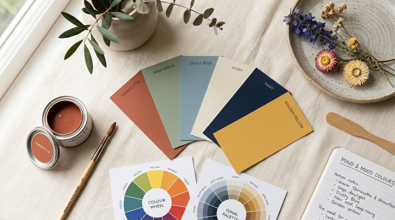
Every room tells a story before anyone speaks a word in it. The width of the space, the quality of the light, the temperature it suggests on a warm afternoon — all of it is shaped, in large part, by colour. A well-chosen wall colour makes a room feel considered and restful. A poorly chosen one makes even expensive furniture look wrong and people leave faster than they mean to.
This is not superstition or abstract design theory. There is a body of research, built up over decades of environmental psychology, architectural study, and behavioural observation, that describes with reasonable precision how colour affects human perception and mood. Understanding even the basics of that research makes colour selection a much more confident act — and saves a great deal of expensive repainting.
This guide covers the core principles of colour psychology as they apply to interior spaces, then works through each room type with practical recommendations rooted in how people actually use those rooms and how light behaves in them.
Why Colour Affects How We Feel in a Space
Colour perception is physiological before it is aesthetic. When light reflects off a painted surface and reaches the eye, the brain processes not just the hue but the wavelength, the intensity, and the contrast with surrounding surfaces. That signal reaches the limbic system — the part of the brain responsible for emotional response — before it reaches the analytical cortex. In practical terms, you feel a colour before you think about it.
Warm colours — reds, oranges, terracottas, and warm yellows — carry longer wavelengths and are associated with energy, warmth, and appetite. They advance visually, meaning they appear to move toward the viewer, which makes walls painted in warm shades feel closer. This is useful in a large, cold, under-furnished room and counterproductive in a compact space already at capacity.
Cool colours — blues, blue-greens, soft greens, and violet-toned neutrals — carry shorter wavelengths and are associated with calm, focus, and spatial expansion. They recede visually, making walls feel further away. A small room painted in a well-chosen cool tone can feel genuinely more spacious than its floor plan suggests.
Neutral colours — off-whites, warm greys, taupes, stone, and greige — are not passive. Every neutral has an undertone that pulls toward warm or cool, and that undertone determines how the room reads under different lighting conditions. A neutral that looks elegant in a north-facing showroom can turn sickly or flat in a south-facing room with strong afternoon sun. Understanding the undertone of a neutral is as important as choosing the right hue.
Saturation and value matter as much as hue. A deep, highly saturated colour creates intimacy and drama. A pale, low-saturation version of the same hue creates openness and calm. Two rooms painted the same blue look and feel entirely different if one is a rich navy and the other is a washed-out powder blue — even though both register as blue at the level of description.
How Light Changes Everything
A colour swatch in a shop and the same colour on your wall at home can look like completely different choices, and the reason is almost always light. Understanding how light interacts with colour is the single most useful thing you can learn before picking a paint.
Direction of natural light. North-facing rooms receive cool, indirect daylight with no direct sun at any point in the day. Cool colours become flat and grey in these conditions; warm colours come alive. A terracotta, warm ochre, or peachy coral that looks garish in a sunny showroom becomes genuinely sophisticated in a north-facing room where it provides the warmth the light cannot.
South-facing rooms receive strong, warm light for most of the day. Cool colours — dusty blues, sage greens, soft greys — balance the warmth of the light and keep the space from feeling overheated. Bold, saturated warm colours in south-facing rooms can feel overwhelming by midday.
East-facing rooms get warm morning light that turns neutral by afternoon. Colours chosen in morning light will look different in the same room at 3 pm. Test across a full day, not just at the convenient moment you are standing in the room with samples.
West-facing rooms are dark in the morning and dramatically warm in the afternoon and evening. They handle bold, saturated colours well, because the evening light gives even a deep shade a golden quality. The same room in the morning can feel dim and heavy — something worth considering for rooms used primarily in the morning.
Artificial light adds another variable. Incandescent and warm LED light sources deepen warm tones and flatten cool ones. Cool white LEDs do the opposite. A colour tested only in daylight can look quite different under the evening lighting of the same room. Always evaluate paint samples under the actual light sources that will be in use, not just in daylight.
Colour and Room Size: The Perceptual Rules
Colour is one of the most powerful tools available for adjusting how large or small a room appears to the eye — and unlike construction work, it is completely reversible.
To make a room feel larger: use light, cool, low-saturation colours on walls. Paint the ceiling the same colour as the walls, or a lighter tone of the same shade, to eliminate the visual boundary between wall and ceiling and allow the eye to read the space as continuous. Keep trim and skirting close in value to the wall rather than starkly contrasting, which also removes boundaries the eye reads as interruptions.
To make a large room feel more intimate: use deeper, warmer, higher-saturation colours on the walls. Lower ceilings visually by painting them a shade darker than the walls. Introduce contrast between walls and trim to divide the space into defined elements. A large, echoing room that feels cold and empty is far more welcoming in a warm terracotta or a deep sage than in the plain white it was handed to you in.
To alter proportions: paint the end walls of a long, narrow corridor in a deeper shade than the side walls to visually pull that far wall closer and widen the sense of the space. Paint a low ceiling white while keeping the walls in a deep tone to push the ceiling upward. Colour can effectively reshape the perceived geometry of a space without touching the architecture.
Room-by-Room Colour Psychology
Bedrooms. The bedroom asks for rest above everything else. Colours that support rest are those that calm the nervous system — dusty blues, soft greens, warm lavenders, quiet taupes, and off-whites with warm undertones. Research in sleep environments consistently points to cool and muted tones as supporting relaxation and faster sleep onset. Saturated, energetic colours — bright reds, vivid oranges, sharp yellows — raise alertness and are genuinely counterproductive in a room intended for sleep. If you love bold colour, concentrate it in textiles and accessories rather than on the walls, where it surrounds the eye from every direction.
Living rooms and family areas. These rooms serve multiple purposes simultaneously — conversation, relaxation, entertainment, and sometimes work. The most successful living room colours are warm neutrals and mid-tones that feel welcoming without being demanding: warm stone, greige, dusty sage, muted terracotta, and soft teal all work well because they are not so energetic that sustained time in the space becomes tiring, and not so passive that the room feels cold or unfinished. A feature wall in a deeper version of the room tone adds depth and a focal point without committing the entire room to a bold colour.
Kitchens. Kitchens are active, social spaces where people tend to feel comfortable in warmer, more energetic colour environments. Warm whites, creamy ivories, soft terracottas, warm yellows, and sage greens all perform well. Blues and greens in a kitchen work best when they lean warm rather than cool — a teal with a green undertone reads very differently from the same value of a blue-grey, and the teal feels far more at home in most kitchens. Avoid very dark or very saturated colours in small kitchens, as they make an already compact, heavily used space feel more enclosed.
Bathrooms. Bathrooms are small, moisture-rich spaces where colour can either make the room feel like a calm retreat or a clinical utility. Soft greens, aquas, warm whites, and pale stone tones are the most popular choices for good reason — they suggest cleanliness and calm without reading as hospital-like. Deep, jewel-toned bathrooms — navy, bottle green, charcoal — can be genuinely luxurious in larger bathrooms with strong natural light, but they require good lighting in compact spaces to avoid feeling cave-like.
Home offices and study rooms. Cognitive performance research points consistently toward cooler, lower-saturation environments for sustained concentration. Soft blues, blue-greys, quiet greens, and warm white with a slight grey undertone support focus better than warmer, more stimulating colours. At the same time, an entirely cold and colourless office can feel draining over a long working day. A warm neutral on three walls with a single cooler, more purposeful accent wall behind the desk often strikes the most effective balance.
Children's rooms. Young children respond strongly to colour and tend to enjoy more saturated, energetic shades than adults, which makes the instinct to paint a child's room in bold primary colours understandable. In practice, though, highly saturated walls in a room where a child also needs to sleep can work against rest. A useful approach is to use mid-toned, slightly muted versions of children's favourite colours — a soft turquoise rather than bright cyan, a dusty coral rather than sharp orange — which satisfy the desire for colour and personality while remaining liveable through the full day and into bedtime.
Hallways and entrance areas. The entrance sets the tone for the entire home and the entire visit. A hallway that is dark, neutral, and uninteresting makes the rest of the home feel like a recovery from a poor first impression. Bold colour works exceptionally well in hallways because people are passing through rather than sitting in the space — the drama that would feel overwhelming in a bedroom is invigorating in a corridor. Deep greens, warm mustards, rich terracottas, and confident charcoals all make strong entrance statements, particularly when the hallway receives enough light to carry a deeper shade.
How to Test Colours Before Committing
No paint chip, phone screen, or digital visualisation tool replaces paint on the actual wall. The surface texture, the adjacent colours, the room dimensions, and the quality of the light in your specific space all change how a colour reads. Testing is not optional — it is the only reliable way to make a confident decision.
Paint a sample area of at least half a square metre, ideally a full metre square, directly on the wall in the room. Observe it across a full day: early morning, midday, late afternoon, and in the evening under your actual artificial lighting. Look at it against the flooring, the ceiling, and the furniture that will be in the room. Notice whether it feels the same at 8 am and 6 pm, and if it does not, decide which time of day matters most for how that room is used.
Test more than one colour at the same time, side by side on the same wall. It is very difficult to evaluate a colour in isolation, because colour is always seen in relation to its surroundings. Two colours that each look good in the shop may clash on the same wall, or one may make the other look better than either looked alone.
Do not evaluate the sample in direct sunlight or the result will be misleading. Step back far enough to see the whole wall rather than just the sample. And resist the instinct to decide quickly — live with the samples for two or three days before committing, because the colour you feel comfortable with on day three is a better guide than the colour that impressed you when you first rolled it on.
Colour Combinations That Consistently Work
Colour relationships matter as much as individual colour choices. A colour that is beautiful on its own can look wrong next to the wrong companion, and the right pairing can make both colours look better than either does alone.
Tone-on-tone. Using different values of the same colour family — a warm white on the ceiling, a mid-stone on the walls, and a deeper taupe on a feature wall — creates a layered, sophisticated result that is very difficult to get wrong, because the colours are already harmonious by virtue of sharing the same base.
Warm wall, cool trim. Warm mid-toned walls with cool white trim (a slightly blue-tinted rather than creamy white) is a classic combination in traditional interiors because the contrast between warm and cool makes both read more clearly. The reverse — cool walls with warm cream trim — is equally valid and tends to feel softer and more relaxed.
Complementary accents. A primarily cool room — dusty blue walls, grey undertone floor — benefits enormously from a single warm accent, such as a terracotta cushion, a warm timber surface, or a mustard curtain. Colour psychology is partly about contrast: a warm accent in a cool environment has far more visual impact than the same colour in a warm room, because the contrast makes it register with more intensity.
Colour and the Zorvanta Deco Gold Pro Range
Choosing the right colour is only half the work — the finish and the quality of the product determine how that colour actually appears on the wall and how long it holds. Our Deco Gold Pro interior range is formulated to deliver colour accuracy and depth from the first coat, with a finish that does not drift or chalk under the Indian indoor climate. The fade-resistant formulation means the colour you chose remains the colour you live with, rather than lightening progressively over the first two monsoons.
For walls where colour is part of a textured decorative scheme, our Texture Gold Pro range allows tinted bases and topcoat combinations that add physical depth to the colour — the peaks and hollows of a textured surface catch light differently and give even a simple mid-tone far more visual character than a flat painted equivalent.
Browse the full interior range, or read our companion guides on choosing the right paint finish, decorative texture finishes, and planning your interior paint scheme room by room. For colour advice specific to your space, contact our team or request a quotation.
Frequently Asked Questions (FAQs)
1. What colour makes a small room look bigger?
Light, cool, low-saturation colours make a room feel larger by visually receding from the eye. Off-whites, pale blues, soft grey-greens, and quiet stone tones all work well. Painting the ceiling the same shade as the walls, or a slightly lighter version, removes the visual boundary between wall and ceiling and extends the sense of height. Avoid stark contrasts between walls and trim in small rooms, as every boundary the eye registers reads as a limit on the space.
2. Which colours are best for a bedroom?
Calm, cool, and muted tones support rest most effectively — dusty blues, soft greens, warm lavenders, and quiet taupe or greige neutrals. Research in sleep environments points consistently toward lower-saturation, cooler hues. Highly saturated warm colours raise alertness and are counterproductive in a room intended for rest, however attractive they might look in other contexts.
3. Why does my wall colour look different at night than in daylight?
Because artificial light and daylight have different colour temperatures. Warm white light sources deepen warm tones and flatten cool ones; cool white lights reverse that effect. The undertone in a neutral — whether it pulls warm or cool — becomes much more visible under artificial light than in balanced daylight. Always test paint samples under the actual light sources in the room, not just during the day.
4. Is white always a safe choice for interior walls?
Not exactly. There are hundreds of whites, each with a different undertone — warm, cool, pink, green, yellow, or grey — and a white chosen without considering the room's light and existing finishes can look dirty, clinical, pink, or green depending on conditions. A warm white works beautifully in a room with cool natural light; a cool white looks crisp in a south-facing room with strong sun. Choosing the right white requires the same process of testing and evaluation as any other colour.
5. Can dark colours make a room feel depressing?
No — used well, deep colours create intimacy, richness, and a sense of enclosure that many people find deeply comfortable. A navy bedroom, a dark green study, or a charcoal hallway can feel sophisticated and welcoming rather than oppressive, provided the lighting is adequate and the colour is chosen to suit the room's proportions and orientation. The key is sufficient light — a dark colour in a poorly lit, north-facing room with small windows can feel heavy. The same colour in a well-lit space with good artificial lighting is entirely different.
6. How do I choose between warm and cool neutrals?
Follow the light in the room. North-facing rooms with cool, indirect daylight benefit from warm neutrals — stone, taupe, greige, or cream — that provide the warmth the light cannot. South-facing rooms with strong warm light benefit from cool neutrals — grey, greige with a blue or green undertone, or off-white with a grey cast — that balance the warmth of the sun. When in doubt, test both a warm and a cool option on the same wall and compare them across a full day.
Need help choosing the right finish?
Talk to our team or request a tailored quotation for your project.