Wall Texture Finishes: A Complete Guide to Decorative Texture Painting for Interiors and Facades
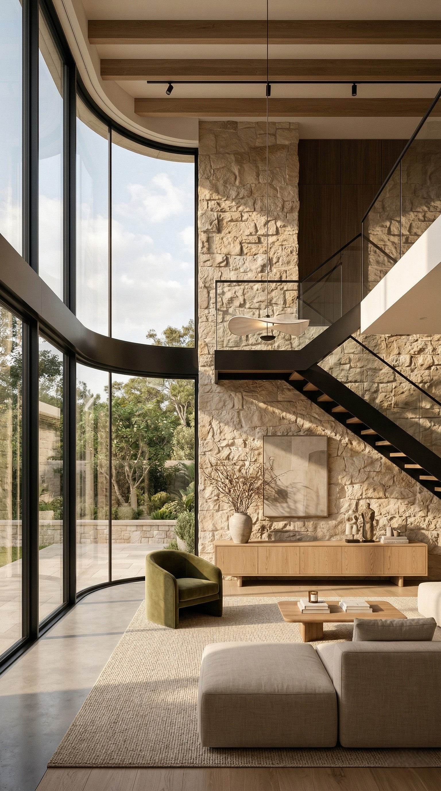
A flat painted wall gives you exactly one thing: colour. Move around the room, change the time of day, switch on a lamp, and it looks essentially the same from every angle. A textured wall behaves completely differently. Its surface is made of thousands of tiny peaks and hollows, and every one of them catches light on one side and casts a shadow on the other. Walk past it and the pattern shifts. Let morning light rake across it and it comes alive. That is why a single textured elevation can carry an entire room, and why designers reach for texture when a space feels correct but lifeless.
Texture is also deeply practical, which is the part most people miss. A textured coating is thicker than ordinary paint, it disguises the imperfections that flat sheens expose mercilessly, and on an exterior it puts more material between the weather and the masonry. Handled well, it is one of the few decisions in a project that improves both how a wall looks and how long it lasts.
Handled badly, though, texture is unforgiving. It cannot be sanded back like a coat of emulsion, patch repairs show, and a pattern that looked charming on a small sample can feel overwhelming across an entire room. This guide walks through the whole subject the way a specifier would — what a texture system actually is, which finish belongs where, how the work is applied, and what it costs to live with.
What a Texture Finish Actually Is
The phrase “texture paint” suggests a single product in a tin. In practice, a decorative texture finish is a small system, and understanding the parts explains almost every result you will ever see.
The base. Sound, stable plaster or masonry, repaired and primed so absorption is even. Texture hides small flaws, but it faithfully reproduces large ones — a bowed wall stays bowed, and a moving crack keeps moving.
The texture medium. This is the layer that creates the relief. Depending on the system it may be a heavy-bodied acrylic compound, a mineral or cementitious material, or a fine polymer-modified plaster. It is applied far thicker than paint and then worked with a tool while it is still open, which is what forms the pattern.
The colour. Sometimes the texture medium itself is tinted, so the colour goes all the way through the relief. Sometimes colour is applied over the cured texture as a topcoat, or as two tones that highlight the peaks and settle into the hollows. The choice matters more than it sounds: a through-coloured texture wears gracefully because a chip does not reveal a different colour underneath.
The protective layer. Many decorative finishes are sealed with a clear or tinted protective coat that adds washability, controls the final sheen, and on exteriors provides the ultraviolet and water resistance the decorative layer alone may not have. Skipping this on a wall that will be touched or rained on is a common and expensive shortcut.
Once you think of texture as a system rather than a product, the questions change usefully. Instead of asking which texture looks nicest, you start asking what the base can support, how the surface will be cleaned, and which layer is doing the protecting.
Why People Choose Texture — Beyond Appearance
There are four honest reasons to specify a textured finish, and only one of them is decorative.
It creates depth that colour cannot. Flat paint reflects light uniformly. A relief surface produces continuous micro-shadowing, which reads to the eye as richness and material weight. This is why a mid-grey texture can feel far more expensive than a mid-grey emulsion of identical colour.
It forgives an imperfect substrate. Older buildings rarely have perfectly flat plaster. A satin or gloss finish will highlight every ripple and trowel mark; a texture absorbs them into its own pattern. On renovation work this alone can save the cost of re-plastering an entire elevation.
It adds film thickness. More material on the wall generally means more protection, and several texture systems are formulated with enough flexibility to bridge the fine crazing that appears in aged plaster as it expands and contracts. That is genuinely valuable on sun-facing exteriors and compound walls.
It defines space without building anything. A single textured elevation behind a bed, a sofa, or a reception desk creates a focal point and a sense of zoning that would otherwise require panelling, cladding, or joinery at several times the cost.
The Main Families of Decorative Texture
Manufacturers name their finishes creatively, and the same effect appears under a dozen different trade names. Underneath the naming, most textures belong to a handful of families defined by how the relief is produced.
Granular and sand-type finishes. The relief comes from aggregate suspended in the coating rather than from tooling. The result is an even, fine-to-medium grain with no directional pattern, which makes it one of the easiest textures to apply consistently over large areas. It is a workhorse for exterior elevations, boundary walls, and stairwells where you want durability and quiet character rather than drama.
Roller and comb patterns. A patterned roller, comb, brush, or sponge is drawn through the wet compound to leave a repeating motif — stipple, swirl, drag, crosshatch, or a fine linen-like weave. These are the most economical decorative textures because the pattern is mechanical and quick to produce, and the depth can be tuned simply by how much material is laid on.
Trowel-applied plaster effects. Here the material is laid on and worked with a steel trowel or float to leave overlapping planes, soft irregular edges, and a hand-made rhythm. This family covers everything from rustic stucco to the smooth, subtly mottled finishes often described as Italian or Venetian plaster. Applied well, the highly polished versions have a stone-like depth that photographs beautifully. They are also the most skill-dependent finishes on this list, and the difference between an experienced applicator and an inexperienced one is impossible to hide.
Metallic, pearl, and glazed effects. A translucent metallic or pearlescent layer is worked over a textured or smooth base so that the relief catches and scatters light. The effect changes dramatically with viewing angle and light source, which makes it striking in entrance lobbies, feature niches, and hospitality interiors — and demanding in ordinary rooms, where it can read as restless.
Stone, brick, and material-imitation finishes. Heavy compounds are carved, stamped, or built up and then colour-washed to imitate cut stone, exposed brick, weathered concrete, or rammed earth. On a well-executed job the result is convincing at conversation distance and vastly lighter and cheaper than real cladding. On a poor one it looks exactly like paint pretending to be stone, so this is a family where the sample panel matters most.
Fine and low-relief textures. Not every texture needs to be obvious. Very shallow finishes — suede, silk, fine sand, brushed effects — give a wall a soft, fabric-like quality that most people register as expensive without being able to name why. These suit bedrooms, formal living rooms, and any space where you want warmth without visual noise.
Choosing the Right Texture for the Space
Two questions settle most decisions: how close will people stand to this wall, and what will touch it?
Deep, aggressive textures work at distance. On a double-height lobby wall, a compound wall, or a facade viewed from the street, a strong relief reads as confident and holds its own against the scale of the building. Bring the same texture into a small bedroom and it becomes overbearing, because the eye is now half a metre away and reading every peak individually.
Close-range walls want restraint. Bedrooms, dining rooms, and study areas are better served by shallow relief and subtle tonal variation. The finish should reward attention rather than demand it.
Contact surfaces want smoothness. Any wall people brush past — narrow corridors, staircase sides, the strip behind dining chairs — will collect scuffs in a coarse texture and is uncomfortable to lean against. Keep those areas smooth and washable, and put the texture where it can be seen but not rubbed.
Wet and greasy zones want a different answer entirely. Kitchen splash areas and shower enclosures need a hard, non-absorbent, easily cleaned surface. Texture holds oil mist and soap residue in its hollows, and no amount of scrubbing brings it back cleanly. Use texture on the dry walls of these rooms if you like the look, but not where water and cooking film land.
One more restraint worth accepting: texture is a feature, not a wallpaper. In most rooms a single elevation carries the effect, with the remaining walls in a coordinated flat finish. Texturing every surface in a room usually flattens the impact rather than multiplying it, because there is no plain field left for the eye to rest against.
Interior and Exterior Texture Are Different Disciplines
They look related and they are not. An interior texture is judged almost entirely on appearance, tactility, and how it behaves under artificial light. An exterior texture has to survive driving rain, ultraviolet radiation, thermal cycling, dust, and biological growth, all while looking deliberate from thirty metres away.
That leads to real specification differences. Exterior systems need genuine ultraviolet stability, water resistance, and resistance to algae and fungus, because a texture on a shaded elevation offers moisture plenty of places to sit. Deep horizontal ledges within a pattern are a liability outdoors, since they trap dust and water — textures that shed rather than collect age far better. And exterior colour choice follows the same rules as any facade: mineral tones hold up under strong sun, while highly saturated organic shades fade first, and the fading is more visible on texture because the exposed peaks weather faster than the sheltered hollows.
An interior finish carried outdoors because the client liked the sample is one of the most common causes of premature texture failure. The two products are not interchangeable, however similar the pattern looks.
Preparation: What Texture Hides and What It Does Not
Texture is generous about small defects and completely unforgiving about structural ones. Knowing which is which prevents most disappointments.
It hides minor trowel marks, fine surface roughness, small patch repairs, slight variations in plaster tone, and the general unevenness of an older wall.
It does not hide a wall that is visibly out of plane, active dampness, efflorescence, hollow or debonded plaster, or a live crack. Applying a heavy decorative finish over any of these buries an unsolved problem under an expensive layer that is difficult and costly to remove.
So the preparation sequence is the same discipline any good paint job demands, with a little more emphasis in two places. First, moisture: because texture systems are thicker and less breathable than thin emulsions, trapped moisture has fewer escape routes and shows up later as blistering or dark patching. Fix the source, then allow generous drying time. Second, alkalinity: new cementitious plaster is strongly alkaline and needs weeks rather than days to settle, followed by an appropriate primer. Rushing it is a classic cause of patchy colour and poor adhesion.
Beyond that, the essentials are familiar: remove everything unsound, cut out and repair cracks properly rather than filling them cosmetically, wash off dust, chalk and growth, and prime so that absorption is uniform across old and new areas. An uneven primer coat under a texture produces uneven colour depth in the finish, and there is no easy way to correct it afterwards.
Application: Where Texture Jobs Are Won and Lost
Textured work is far more sensitive to method than flat painting, because you are not just distributing colour — you are producing a pattern by hand, and the human hand drifts.
Make a sample panel first, at real size. A 300 mm swatch tells you almost nothing about how a pattern reads across four metres. Produce at least a square metre, on the same substrate, with the same tools, the same applicator, and the same material batch, and then look at it on the actual wall in daylight and under the room lighting that will be installed. This single step prevents most texture regrets.
Finish a wall in one continuous session. This is the rule that matters most. Textured compounds set as you work, and a stop-and-restart line in the middle of an elevation is permanent — it cannot be feathered out the way a paint lap mark can. Plan the day so that each wall runs corner to corner without a break, and put the natural stopping points at architectural breaks: internal corners, columns, beam lines, or a change of plane.
Work in pairs on large areas. The common professional arrangement is one person laying material on at a steady thickness while the second follows immediately behind with the tooling. That keeps the leading edge open and the pattern consistent, which one person cannot reliably do beyond a certain area.
Keep the pattern honest. Repeating a hand-tooled pattern too regularly looks mechanical and cheap; drifting too far looks careless. Good applicators vary the direction and overlap just enough to feel natural, and they check the whole elevation from a distance regularly rather than judging it from an arm away.
Control thickness deliberately. The depth of relief is a design decision, not an accident of how much material happened to be on the trowel. Thicker is not automatically better — excessive build can slump on vertical surfaces, cure unevenly, and crack as it shrinks.
Respect the environment. Working in direct sun or a hot draught skins the surface before it can be tooled, giving you a wall that is half pattern and half scar. Very cold or damp conditions delay the set and can leave the finish soft or patchy. Follow the shade around a building rather than working straight across an elevation.
Seal it when the system calls for it. If the finish specifies a protective topcoat, apply it. That layer is usually what delivers washability, stain resistance, sheen control, and weather protection. A decorative wall left unsealed because it “looked finished” is a wall that will mark the first time somebody touches it.
Colour, Light, and How the Wall Will Be Lit
Lighting affects a textured wall far more than a flat one, because the entire effect depends on shadow. Light that strikes the surface at a shallow angle — a wall washer, a concealed cove, a slim uplight at the skirting — exaggerates every peak and hollow and makes the texture look deep and sculptural. Light arriving straight on from the middle of the room fills in the shadows and can flatten the same wall into what looks like ordinary paint.
This cuts both ways. Grazing light is a gift when the workmanship is excellent, and a merciless critic when it is not, because it reveals every inconsistency along with the pattern. If you plan to graze-light a feature wall, the standard of application has to match the lighting.
On colour, two-tone treatments are what give many decorative finishes their character: a base shade in the hollows with a lighter or metallic highlight caught on the peaks. Keep the two tones close together in value unless you want an emphatically rustic effect — a wide contrast reads as decorative paint effect, while a narrow one reads as material. And as with any wall colour, judge it at full scale in the actual room across a full day, never from a card held indoors.
Living With a Textured Wall: Cleaning and Repair
This is the part of the decision most people never think about until it is too late.
Cleaning. Relief collects dust, and coarse relief collects more of it. Routine care is simple — a soft brush or a vacuum brush attachment periodically, and a light wipe with a damp cloth on sealed finishes. What you cannot do is scrub aggressively; abrasive cleaning knocks the tips off a texture and leaves shiny, worn patches that catch the eye immediately.
Repair. Be realistic: patching a texture invisibly is genuinely difficult. A flat wall can be touched up and blended, but a hand-worked pattern has a rhythm that a small repair will not match, and the new material rarely ages into the old at the same rate. The practical answer is to plan repairs by the panel rather than by the patch, which is another reason to let architectural breaks define where each section of work starts and stops. It is also worth keeping a record of the exact system, colour, and applicator used, because matching a decorative finish years later without that information is close to impossible.
Repainting later. A textured wall can be recoated in a new colour, but the relief stays. Removing texture to return to a flat surface means mechanical removal and re-plastering, which is a construction job rather than a painting one. Choose texture on the understanding that the pattern is a long-term commitment even if the colour is not.
Thinking About Cost Honestly
Textured finishes cost more per square metre than plain emulsion, and the reasons are worth understanding because they tell you where to spend.
Material consumption is higher, sometimes substantially, since you are building a thick layer rather than a thin film. Labour is higher still, because the work is slower, often needs two people, and depends on skill that commands a premium. Many systems also require a separate protective topcoat, adding another pass.
Against that, texture can genuinely save money elsewhere. It can rescue an uneven wall that would otherwise need re-plastering. It can deliver the visual weight of cladding or panelling at a fraction of the price. And on exteriors, the extra film thickness contributes to protection that a thin coat cannot match.
The sensible strategy for most projects is concentration rather than coverage: pick the walls that actually earn a decorative finish — the elevation behind the bed, the entrance wall, the facade the street sees — specify a good system and a skilled applicator there, and keep everything else in a well-chosen flat or low-sheen finish. That produces a better-looking result than spreading a cheaper texture thinly across every wall in the building.
Common Texture Mistakes to Avoid
- Judging a pattern from a small sample card instead of a full-size panel on the actual wall.
- Applying decorative texture over damp, efflorescent, or hollow plaster, which buries a defect under an expensive finish.
- Stopping mid-elevation and resuming later, leaving a permanent join line.
- Using an interior decorative finish on an exterior wall because the sample looked right.
- Specifying a deep, coarse relief in a small room or along a corridor people brush past.
- Texturing every wall in a room and leaving the eye nowhere to rest.
- Skipping the protective topcoat and then discovering the wall cannot be cleaned.
- Working an elevation in direct sun so the surface skins before it can be tooled.
- Choosing a highly saturated shade for a sun-facing textured facade without allowing for uneven fading on the exposed peaks.
- Failing to record the system, colour, and applicator, which makes any future repair a guessing game.
Decorative Texture Systems from Zorvanta
Our Texture Gold Pro range is built for exactly this work — a premium decorative texture coating designed to produce rich, well-defined relief with strong coverage, dependable adhesion, and the weather resistance that Indian interior and exterior conditions demand. For coordinated colour on the surrounding walls, or for a smooth decorative scheme alongside a textured feature, our Deco Gold Pro range offers fade-resistant colour stability that lets the whole elevation age together rather than in pieces.
Browse the full decorative and texture range, read our companion guides on surface preparation before painting and protecting exterior walls from monsoon and heat, or request a quotation for your project. If you would like help matching a texture system to a particular wall, room, or facade, contact our team and we will guide you through the options.
Frequently Asked Questions (FAQs)
1. What is texture paint and how is it different from normal wall paint?
Normal paint is a thin film that adds colour. A texture finish is a much thicker decorative system — a heavy-bodied compound applied over a prepared, primed base and worked with a tool to create relief, usually followed by colour and a protective topcoat. The pattern of peaks and hollows creates light and shadow, which is what gives a textured wall its depth.
2. Can texture be applied to every wall in a room?
It can, but it rarely looks better. Texture works best as a feature on one elevation, with the remaining walls in a coordinated flat or low-sheen finish so the eye has a plain field to rest against. Texturing every surface tends to reduce the impact rather than multiply it, and it adds cost across areas where nobody is looking.
3. Does texture hide cracks and uneven walls?
It hides minor unevenness, small patch repairs, and fine surface roughness very effectively. It does not hide a wall that is visibly out of plane, active dampness, hollow plaster, or a live structural crack. Those must be diagnosed and repaired first, because a heavy decorative layer over an unsolved problem is expensive to remove later.
4. Is textured wall finish suitable for exteriors?
Yes, provided you use a system formulated for exterior exposure. Exterior textures need ultraviolet stability, water resistance, and resistance to algae and fungus. Interior decorative finishes used outdoors fail early. Patterns that shed water also age better outdoors than patterns with deep ledges that trap dust and moisture.
5. How do you clean a textured wall?
Dust it periodically with a soft brush or a vacuum brush attachment, and wipe sealed finishes gently with a damp cloth. Avoid aggressive scrubbing and abrasive cleaners, which wear the tips of the relief and leave shiny patches that are very noticeable. Washability depends largely on whether the specified protective topcoat was applied.
6. Can a damaged textured wall be repaired invisibly?
Small patch repairs are difficult to blend, because a hand-worked pattern has a rhythm that a localised repair rarely matches. The practical approach is to repair by the panel, working between architectural breaks such as corners, columns, or beam lines. Keeping a record of the system, colour, and applicator makes future matching far easier.
7. Why does texture cost more than regular painting?
Material consumption is higher because you are building a thick layer, the application is slower and often needs two people working together, the skill required commands a premium, and many systems need an additional protective topcoat. Concentrating a quality texture on the walls that matter usually gives a better result than spreading a cheaper one everywhere.
8. Can I paint over an existing textured wall?
You can recoat it in a new colour after proper cleaning and priming, but the relief remains. Returning to a genuinely flat surface requires mechanical removal and re-plastering, which is construction work rather than painting. Treat the pattern as a long-term commitment even though the colour can be changed.
Need help choosing the right finish?
Talk to our team or request a tailored quotation for your project.