Painting Your Master Bedroom: The Right Colours, Finishes & the Complete Guide for Restful Indian Homes
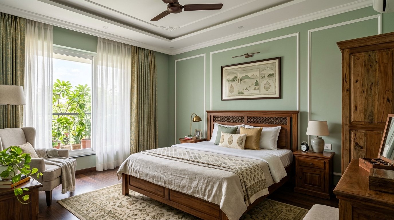
The master bedroom is the only room in the entire house designed exclusively for one purpose: rest. Every other room in an Indian home serves multiple functions — the living room is for family, guests, and television; the kitchen is for cooking and conversation; the study handles work and learning. The bedroom alone is meant to be a retreat, a place where the noise and demands of the day are left outside and the body and mind are allowed to recover. This singular purpose makes it, paradoxically, the room that receives the least considered paint specification in the average Indian home repaint.
Most master bedrooms in India are painted with whatever was ordered for the flat — the same matte white, the same contractor beige — or with a colour chosen quickly from a brochure card under the fluorescent light of a hardware shop. The result is a room that functions, but does not feel like a sanctuary. The wall colour is neutral to the point of blankness. The finish is matte because that is the default. The feature wall, if there is one, is an unrelated accent colour chosen in an afternoon. The room is clean and inoffensive, but it does not actively contribute to the rest, relaxation, and intimacy that a master bedroom is supposed to support.
This guide changes that. Getting the paint specification of a master bedroom right is one of the highest-return design decisions you can make for your own wellbeing, and it requires understanding three things: what colours genuinely support rest in the specific light conditions of Indian homes, which finish is technically correct for a sleeping space, and how to prepare and apply the result to a standard that makes the room feel considered and complete.
Why Bedroom Paint Colour Is Different from Every Other Room
In most rooms of the house, paint colour decisions are primarily aesthetic and social — what looks good, what impresses guests, what suits the furniture. In the master bedroom, the stakes are genuinely different, because the colour of the room you sleep in directly influences how quickly and how deeply you sleep. This is not interior design theory; it is physiology. The visual environment in the hour before sleep onset has a measurable effect on the autonomic nervous system — specifically on whether the parasympathetic system (responsible for rest and recovery) activates properly, or whether the sympathetic system (responsible for alertness and readiness) remains partially engaged.
Colours that create high visual contrast, strong saturation, or strong psychological associations with energy and activity keep the sympathetic system engaged longer. Vivid reds, intense oranges, electric blues, bright yellows — these are colours that photograph well and feel exciting in a showroom, but they actively work against the physiological shift toward sleep. In a well-designed master bedroom, the wall colour should be doing quiet, invisible work: creating a visual environment that allows the nervous system to slow down, the body to relax, and the mind to disengage from the alertness of the day.
The colours that do this work best share certain qualities: they are medium to low in saturation — not vivid, but not absent of colour either. They carry a degree of warmth or softness that avoids the clinical quality of pure whites and stark greys. And they are calibrated for the specific light conditions of the room — its orientation, its natural light quality, and its artificial lighting at night — not chosen from a chip card under a shop fluorescent.
Colour Families That Work in Indian Master Bedrooms
Warm whites and off-whites are the most universally successful starting point for an Indian master bedroom, and they are more nuanced than the term suggests. A pure, bright white — the default choice of contractors and the colour most often left on bedroom walls after a repaint — is not a restful colour. It reflects all wavelengths of light equally, creating a bright, uniform, somewhat stark environment that reads as clean but not warm, functional but not intimate. Under the warm incandescent or warm LED lighting typical of Indian bedrooms, pure white also picks up a faint yellowish cast that can feel dingy rather than warm.
Off-whites — those with a deliberate warm undertone of cream, linen, soft stone, or pale ochre — behave completely differently. Under warm artificial lighting typical of an Indian bedroom at night, they create a glow that pure white cannot achieve: the kind of warm, enveloping light quality that makes a room feel genuinely comfortable at ten in the evening. During the day, a good warm off-white reflects natural daylight without appearing cold or washed out. For a bedroom used late in the evening and through the night, this warm-undertone off-white is the most reliable specification of all.
Soft sage and muted greens have become increasingly common in well-designed Indian master bedrooms, and with good reason. Green is the colour with the widest bandwidth of positive psychological associations — it reads simultaneously as natural, calm, and grounded, without the emotional complications that affect other colour choices. Soft sage — a grey-green with a slightly warm undertone — works particularly well in Indian bedrooms because it is neutral enough to pair with a wide range of wood tones (teak, sheesham, mango wood are all common in Indian bedroom furniture), it holds its quality under both warm artificial lighting and varied Indian natural light, and it creates a visual environment that registers as calm and restful without being colourless.
The critical qualifier is the word soft. A vivid or saturated green — lime, emerald, bright olive — is not the correct specification for a bedroom. The muted, slightly greyed version of sage or dusty green is what delivers the restful quality; the saturation must stay low enough that the colour reads as a quiet presence rather than a visual demand.
Dusty blues and soft blue-greys are another well-established bedroom palette, particularly effective in south- and west-facing Indian bedrooms where warm afternoon light is abundant. Soft blue reduces visual temperature — it reads as cooler and quieter than warm tones — and is consistently identified as one of the most conducive bedroom colour families. The critical caveat in the Indian context is that blue must be chosen with care under warm artificial lighting. A cool, slightly icy blue will look beautiful in a north-facing room with cool natural light, but will read as slightly greenish or grey under warm LED lighting — which is exactly the lighting used during pre-sleep hours when bedroom colour matters most. The correct blue for an Indian bedroom under warm artificial lighting is a slightly warmer blue — a blue with a hint of grey or warm undertone — that holds its character without looking cold or flat at nine in the evening.
Warm terracotta, dusty rose, and clay tones are the bedroom colour choices most rooted in Indian tradition, and they remain among the most successful in the Indian context precisely because they were developed in response to Indian light conditions over centuries. These warm earth tones respond to the golden quality of Indian daylight — they become richer, warmer, and more alive as the sun moves through the day, and under warm artificial light at night they create an intimate, enclosing warmth that is genuinely restful. For a master bedroom used by a couple, the warmer palette often feels more romantically appropriate than cooler or more clinical tones. The key, again, is saturation: a deep, highly saturated terracotta on all four bedroom walls is stimulating rather than restful. The same colour family at a softer, more muted depth — a dusty clay, a warm blush, a pale terracotta — delivers the warmth and intimacy without the overstimulation.
The Feature Wall in the Master Bedroom: Getting It Right
The bedroom feature wall — almost always the wall behind the bed headboard — is one of the most compositionally important decisions in any Indian master bedroom. Done correctly, it creates a focal point that gives the room a sense of considered design, frames the bed beautifully, and adds visual depth without disrupting the room's restful quality. Done carelessly, it is a distracting anomaly that makes the room feel unresolved.
The most reliable approach for a master bedroom feature wall is to use a deeper, richer version of the primary wall colour rather than a completely different hue. If the three main walls are in a soft sage green, the feature wall behind the bed in a deeper, more saturated sage — or a dark, moody green — creates a sophisticated compositional relationship that feels designed rather than accidental. If the main walls are a warm off-white, a feature wall in a warm charcoal, a deep clay, or a muted ochre creates the same effect. This palette relationship — deeper, not different — consistently produces the most satisfying and long-lasting result in Indian master bedrooms.
Avoid feature walls in vivid or highly contrasting colours behind the bed. The headboard wall is the surface you see as you drift to sleep and the first surface you see when you wake. A vivid or demanding colour on this wall creates precisely the kind of visual stimulation that works against rest. The feature wall in a bedroom should be the quietest, most refined element in the room — a deepening of the palette, not a disruption of it.
Choosing the Right Paint Finish for a Master Bedroom
Finish selection for a master bedroom is more straightforward than for other rooms, because the demands are relatively narrow. A master bedroom does not experience the cooking proximity of a kitchen, the high contact of a corridor, or the crayon impact of a child's room. The finish decision in a bedroom balances two considerations: how the surface looks under bedroom lighting, and how cleanable it needs to be.
Matte finish is genuinely appropriate for master bedrooms in a way that it is not for living rooms, kitchens, or children's rooms. Traffic in a master bedroom is low and largely consists of adults. Contact points are predictable — around light switches, along the door frame, near wardrobe handles — and manageable. Under the warm, low-level ambient and accent lighting typical of Indian master bedrooms at night, a matte finish creates a depth and richness of colour that no other finish can match: the complete absence of sheen means the colour is seen at its purest, with no competing light reflection from the surface. Dark bedroom feature walls in matte finish are particularly beautiful — the colour appears to have real depth and absorption, giving the wall a quality that looks genuinely considered.
The practical limitation of matte is cleanability. For the main bedroom walls that are not near high-contact zones, this limitation is largely irrelevant. For the areas around light switches and door handles, a low-sheen or eggshell finish is a sensible specification that maintains the near-matte appearance while providing enough surface hardness to be wiped clean at those contact points. Many professional painters apply matte on the large wall areas and eggshell on the returns, reveals, and high-contact zones — a two-finish approach that delivers the aesthetic quality of matte across most of the room while managing the practical reality of daily contact in specific locations.
Satin finish in a master bedroom is appropriate when the room has young children coming in regularly, when the bedroom also serves as a home office, or when the occupants simply prefer the slightly more luminous quality of a satin surface. The gentle sheen of a satin finish responds well to the warm directional lighting — bedside lamps, pendant lights — typical in Indian master bedrooms, creating a subtle warmth rather than a clinical brightness.
Indian Light Conditions and Bedroom Colour: What Changes Room Orientation
Indian homes span an enormous range of climates and light conditions — from the cool, clear light of Shimla to the hot, hazy light of Chennai — and the specific orientation of a bedroom window dramatically changes how a wall colour reads across the day. Understanding this relationship is the difference between choosing a colour that looks correct on a sample card and one that looks correct in your actual bedroom.
South-facing master bedrooms receive generous warm light for most of the day — afternoon sun floods the room with a golden quality that enriches warm tones and gives cooler tones a warmth they would not otherwise have. South-facing bedrooms can handle slightly cooler or more neutral palettes without feeling cold, because the light quality itself provides the warmth. A dusty blue or a grey-green that might feel cold in a north-facing room feels balanced and comfortable in a south-facing bedroom with afternoon sun.
North-facing master bedrooms receive cool, indirect light throughout the day — they never have direct sun, and the light is consistent but lower in warmth and intensity. Warm tones — off-whites with warm undertones, soft terracottas, warm sages — work far better in north-facing bedrooms because they compensate for the absence of warm natural light. A warm off-white in a north-facing bedroom glows at night under warm artificial lighting and feels welcoming even in the cooler, indirect light of the day.
East-facing master bedrooms receive morning sun — warm, relatively low-angle early light that fills the room for the first few hours and then diminishes through the afternoon. These rooms feel bright and warm in the morning and cooler in the evening. The morning quality of light means warm tones respond beautifully for the period when the bedroom is most actively used; the cooler afternoon means the room needs a colour that holds its quality without the benefit of direct sun.
West-facing master bedrooms are the inverse: cool and shaded in the morning, flooded with warm — sometimes intense — afternoon and evening sun. The warm late-day sun is the most flattering lighting a bedroom receives; almost every colour looks beautiful in it. The practical challenge is that west-facing bedrooms can become hot in summer afternoons, and cooler wall tones — dusty blues, grey-greens — provide a visual counterpoint to the physical heat of afternoon sun.
Surface Preparation for the Master Bedroom
The quality of surface preparation in a master bedroom determines how well even the best paint colour reads at the end of the job. Uneven walls — filled poorly, not sanded smooth, with old roller marks and brush lines from previous coats still visible — create an uneven surface that catches light at different angles and makes the finished colour look patchy, rough, or inconsistent. In a high-visibility room with directional lighting — bedside lamps that throw raking light across the wall surface — any surface irregularity is amplified rather than hidden.
Fill all cracks and holes cleanly with an interior filler, allow it to dry fully, and sand level with the surrounding surface. Sand the entire wall surface lightly to remove any existing gloss and provide mechanical key for the new coat. Wipe down with a clean, damp cloth to remove all sanding dust before applying primer or topcoat. Apply a quality interior wall primer on any areas of fresh plaster or repaired filler — this seals the porosity of the repair and ensures the topcoat applies at a consistent film thickness and sheen level across the full wall. In a bedroom where the lighting is designed to make the walls look beautiful, a well-prepared, smooth surface is the foundation that makes the colour work correctly.
The Zorvanta Approach to Master Bedroom Coatings
At Zorvanta, we understand that painting a master bedroom is not simply a surface finish decision — it is a decision that directly affects the quality of rest and the sense of personal space for the people who live with it every day. Our Deco Gold Pro interior emulsion in matte and eggshell finishes is our recommended specification for master bedroom walls: rich colour depth in matte, practical cleanability in eggshell, and a tinting palette calibrated specifically for the warm, complex light conditions of Indian interiors. Our colour range includes the soft sages, warm off-whites, muted terracottas, and dusty blues that are the most consistently successful bedroom palettes across different Indian home types and orientations — and our team can guide you to the specific depth and undertone within each family that will work correctly for your bedroom's light conditions.
If you are repainting a bedroom that has been the same contractor white for several years, or choosing the colour for a new apartment that is about to become your home, the investment in getting the specification right — the right colour family, the right depth, the right finish, properly prepared — transforms a room you sleep in into a room you genuinely want to come home to. Explore our interior paint range, read our guide on colour psychology in interior spaces, or contact our team for a personalised bedroom colour consultation and quotation.
Frequently Asked Questions (FAQs)
1. What is the best paint colour for a master bedroom for good sleep in India?
Soft, muted tones in the sage green, warm off-white, dusty blue, or warm clay families are consistently the most effective colours for supporting rest in Indian bedrooms. The key quality is low saturation — not vivid or intense — combined with a warmth that suits Indian artificial lighting conditions. Avoid highly saturated, vivid, or very dark all-over colours, which create visual stimulation that works against sleep onset.
2. Should I use matte or satin paint in a master bedroom?
Matte is the ideal finish for most master bedroom walls because it provides the richest, deepest colour quality and has no sheen to compete with bedroom lighting. For high-contact areas — around switches, door frames, and the lower wall sections — eggshell or satin offers more practical cleanability. A combined approach — matte for most of the wall, eggshell on high-contact areas — gives the best of both specifications.
3. What colour works best for a dark or north-facing bedroom in India?
Warm tones are essential for north-facing or low-light bedrooms — off-whites with cream or linen undertones, soft terracottas, and warm sages compensate for the absence of direct sunlight and glow under warm artificial lighting at night. Avoid cool whites, cool blues, and grey-based palettes in north-facing bedrooms, as these amplify the coolness of the indirect light and can make the room feel slightly gloomy even during daytime.
4. How do I choose between a feature wall and painting all four bedroom walls the same colour?
For most Indian master bedrooms, a feature wall behind the headboard in a deeper version of the primary colour is a more refined and successful approach than painting all four walls the same shade. A feature wall gives the room a focal point and a sense of designed composition. The feature wall colour should relate to, not clash with, the primary wall colour — deeper within the same palette family, not a completely different hue.
5. How many coats of paint does a bedroom need?
For a standard bedroom repaint over existing paint in good condition — no bare plaster, no staining — two coats of a quality interior emulsion over a primed surface is the correct specification. If you are painting over a dark existing colour with a significantly lighter new colour, or painting fresh plaster for the first time, a sealer or primer coat plus two topcoats may be needed. Rushing to a single coat in a bedroom, where the surface quality is visible under directional lighting every evening, invariably produces a result that looks thin and patchy.
6. How long does bedroom paint last before it needs refreshing in India?
A master bedroom painted with a quality matte or eggshell interior emulsion over proper preparation should remain in excellent condition for six to eight years. Bedrooms receive the least abrasive contact of any room in the house, and the paint film is not exposed to moisture, heat, or chemical contact. The main factors that bring forward a bedroom repaint are changes in taste or decor, fading of dark feature wall colours on south- or west-facing walls, and minor marking near high-contact zones that cannot be cleaned on a matte surface. Annual light dusting of the wall surface with a soft cloth or dry mop extends the clean life of a bedroom paint significantly.
Need help choosing the right finish?
Talk to our team or request a tailored quotation for your project.