Painting Your Living Room & Dining Area: Colour Schemes, Finish Selection & the Complete Guide for Indian Homes
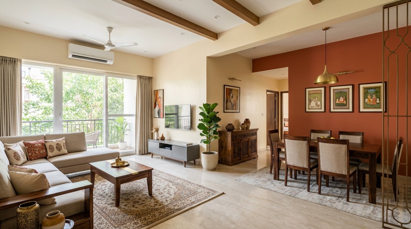
The living room and dining area are the first spaces guests see, the rooms where families gather every evening, and the interiors that define the character of the whole home. They are also the spaces where the wrong paint choice — the wrong colour, the wrong finish, the wrong preparation — becomes apparent fastest and most visibly. A bedroom paint that has started to mark at shoulder height can be excused. A living room wall with yellowing marks near the sofa, or a dining area ceiling with grease haze near the light fitting, is impossible to overlook and permanently affects the impression the home makes.
Despite this, the living room and dining area are rooms where paint decisions are often made quickly and with the least technical consideration — a colour chosen from a brochure under fluorescent shop lighting, a finish selected as "the glossy one" without understanding what that means for day-to-day maintenance, a preparation stage skipped because the previous paint still looks "mostly fine." This guide replaces guesswork with a structured approach: understanding the specific demands of these high-visibility, high-use spaces, and choosing the specification that meets them correctly from the start.
Understanding the Living Room as a Painting Surface
The living room is a fundamentally different painting environment from a bedroom or corridor, and treating it as such is the first step toward a lasting, satisfying result. The surface area is typically larger than any other single room in the home, with taller walls in many Indian independent houses and a ceiling that is often the most prominent visual plane in the room. The room is used for longer continuous periods than most other spaces — several hours every evening — which means the paint is constantly under scrutiny under both natural daylight and artificial lighting. Inconsistency in application, uneven sheen, or minor texture irregularities that would go unnoticed in a bedroom are visible and bothersome in a well-lit drawing room.
The room also carries the highest number and variety of colour-influencing elements of any space in the home: furniture upholstery, curtain fabrics, floor tiles or wood, artwork, decorative cushions, and lighting fixtures all interact with the wall colour continuously. A paint colour that looks perfect in isolation or on a small sample card can look entirely different once surrounded by the furnishings of a specific room. This is one of the most common causes of dissatisfaction with living room paint choices, and it is entirely avoidable with the right approach to colour testing.
Traffic and contact levels in a living room are significant, though different from a corridor or staircase. The lower sections of walls — particularly around sofas, behind television consoles, and near doorways — receive regular contact from clothing, bags, and hands. The wall areas around light switches accumulate finger marks. The dining area, if adjacent or open-plan, has the added challenge of airborne grease and moisture from cooking, which settles on the nearest wall surfaces over time and requires cleaning.
Choosing the Right Paint Finish for Living Rooms and Dining Areas
Finish selection for a living room is a balance between the decorative quality you want to achieve and the practical durability the space demands. The two primary options for Indian living room walls are low-sheen or eggshell finish and satin finish, and understanding the practical difference between them is important before making a choice.
Matte finish, while popular for its soft, depth-enhancing appearance, is not the ideal specification for living rooms in Indian homes where families with children use the space daily. Matte emulsions are the least washable of all interior finishes — marks and smudges cannot be wiped off without leaving a visible clean patch that stands out against the surrounding unwashed surface. For a formal drawing room used occasionally and occupied primarily by adults, matte can work beautifully. For a family living room with daily use, it will require full repainting within two to three years simply because it cannot be maintained in a clean condition through wiping.
Low-sheen or eggshell finish is the correct baseline specification for most Indian living rooms. It dries to a surface that looks nearly matte under most lighting conditions, but has just enough hardness and surface density to be wiped clean with a damp cloth for fresh marks, finger smudges, and light scuffs. The very low sheen level does not show brush marks or roller stipple the way a semi-gloss would, which means the walls look smooth and even across the full room. For a living room where the aesthetic priority is a calm, sophisticated interior with minimal visual noise, low-sheen eggshell delivers the appearance quality of matte with meaningful practical improvement in cleanability.
Satin finish steps up the practical performance significantly, at the cost of a slightly more apparent sheen. In a well-lit, naturally bright Indian living room, a satin wall has a gentle luminosity that can actually enhance the room's sense of light and space — particularly useful in flats where the living room is the primary daylit area. Satin is genuinely washable with a damp cloth and mild detergent, handles finger marks and grease haze much more effectively than eggshell, and is the appropriate specification for dining areas where cooking proximity creates an ongoing need for wall cleaning. If the room has children who use the sofas and adjacent walls as a regular contact surface, satin is the practical choice that will maintain its appearance correctly over a longer service life.
Ceiling paint is a separate specification from wall paint: use a dedicated flat white or off-white ceiling emulsion with zero sheen. A sheen on a ceiling creates unwanted light reflections and reveals every imperfection in the ceiling plaster far more visibly than a flat finish. The ceiling emulsion should be applied before wall painting so that any overspray or roller scatter onto the top edge of the wall can be cut in neatly when the wall coat is applied.
Colour Selection: The Science Behind Living Room Colours in Indian Homes
Colour is both the most personal and the most technically complex decision in painting a living room. The starting point must always be the actual conditions of the specific room — its orientation, its natural light quality and quantity, its ceiling height, its proportions, and the existing furnishing palette — rather than a colour that was admired in a magazine or a friend's home. A colour that transforms a high-ceilinged, south-facing drawing room in a Mumbai villa can make a north-facing apartment living room in Pune feel dim and oppressive.
Indian daylight has a warm, golden quality that is distinctly different from the cooler, bluish light of Northern European countries for which many international colour systems are calibrated. This warm light quality enriches warm-toned paint colours — terracottas, warm creams, ochres, dusty corals, and golden neutrals — and makes them appear more balanced and natural than they would in cooler climates. Cool colours — blues, greens, and grey-based neutrals — need to be chosen with care in warm Indian light, particularly under warm incandescent or LED lighting, where they can appear warmer and less crisp than their colour chip suggests. Pale blues in particular can read as greenish under warm artificial light in an Indian living room, which may or may not be the intended effect.
For smaller or low-light living rooms, the most reliable strategy is a warm, light tone — a warm white, a very pale cream, or a soft warm grey — on the walls, which reflects natural and artificial light evenly and makes the space feel larger and more open. Avoid very dark colours on all four walls of a compact living room; they absorb light and make the space feel enclosed and heavy, regardless of how dramatic they look in large-room photographs. If a darker, more characterful tone is desired, reserve it for a single feature wall — typically the wall behind the sofa or the wall opposite the main seating — and keep the remaining three walls in a lighter complementary tone.
For larger, well-lit living rooms, a wider palette is viable. A medium-depth warm tone — a dusty terracotta, a mature sage green, a warm slate — can be used successfully on all four walls without making the space feel reduced, particularly if the ceiling is high. These mid-depth tones give a living room a composed, deliberate character that flat whites and pale creams do not achieve. They also respond more richly to evening artificial lighting, where a warm-toned paint at medium depth creates an enveloping, welcoming atmosphere rather than the flat, clinical brightness of a white interior under the same light source.
The open-plan living-dining arrangement, now standard in most new Indian apartment designs, presents a specific colour challenge: two functionally different zones are connected spatially, and their paint treatments need to relate to each other without being identical. The most effective approach is to use a single wall colour across both zones — creating visual continuity and making both spaces feel larger — with differentiation achieved through the feature wall. A dining area feature wall in a deeper version of the living room colour, or in a complementary accent tone, defines the dining zone without disrupting the spatial flow. Avoid completely different colours in connected open-plan spaces; the visual discontinuity makes both zones feel smaller and creates an unsettling clash each time you move between them.
The Feature Wall: Doing It Right
The feature wall — or accent wall — is the single most widely requested element in Indian living room painting, and also the element most frequently executed in a way that does not achieve its potential. A feature wall done correctly is a powerful compositional tool; a feature wall done carelessly is a visual afterthought that makes the room look unfinished rather than considered.
The first principle is that the feature wall must be the wall that naturally draws the eye when you enter the room — usually the wall facing the main entrance, the wall behind the primary seating arrangement, or the wall bearing the television console. Painting a side wall or a wall that is not a focal point creates a feature in a location the room's design does not support, and the result feels arbitrary.
The second principle is that the feature wall colour must relate to, not merely contrast with, the adjacent wall colours. A feature wall in a vivid colour on walls painted white creates a jarring, unresolved contrast. A feature wall in a deeper, richer version of the main wall colour — or in a colour from the same family at a higher saturation — creates a composed, intentional contrast that feels designed. The relationship between the feature wall colour and the furnishing palette is also critical: if the feature wall colour has no echo in the cushions, rugs, artwork, or other decorative elements in the room, it sits in isolation and looks like an accident rather than a choice.
Surface Preparation for Living Room Walls
The preparation standard for a living room should be higher than for any other room in the house, precisely because imperfections are most visible here. Every crack must be properly filled and feathered flush with the surrounding surface. Every area of existing paint that is soft, powdery, or poorly adhered must be removed back to sound plaster before the new coat is applied. Any areas of previous staining from leaks, smoke, or grease must be treated with a stain-blocking primer before the topcoat, or the stain will bleed through even multiple coats of fresh paint.
Sand the entire wall surface lightly with a fine-grit sanding block or sanding pad before applying the new coat. This removes any surface gloss from the previous paint, provides mechanical key for the new coat, and flattens any minor bumps or ridge marks from previous brush strokes. Wipe down with a clean, damp cloth to remove all sanding dust before painting; dust left on the surface creates a gritty texture in the finished coat and reduces adhesion.
Apply a quality interior wall primer on any areas of bare or repaired plaster, and on any surface that has not been painted in the last three to four years. Primer seals the porosity of the substrate, prevents the topcoat from sinking in unevenly, and ensures a consistent sheen level across the full wall — a critical detail in a high-visibility room where uneven sheen draws the eye immediately.
The Zorvanta Approach to Living Room and Dining Area Coatings
At Zorvanta, our interior emulsion range is designed around the specific demands of the Indian home environment — the humidity, the temperature cycling, the varied surface qualities of Indian plastered walls, and the social spaces that families in India genuinely use every day rather than preserving for formal occasions. Our Deco Gold Pro interior emulsion in low-sheen and satin finishes is our recommended specification for living rooms and dining areas: smooth application, excellent coverage with consistent sheen, genuine washability in the satin variant, and a colour palette calibrated for the warm light quality of Indian interiors. Our tinting system allows accurate colour matching across the full depth range — from the lightest warm whites through the mid-depth terracottas and sage tones to the deeper, characterful accent shades that work on feature walls.
Our team can assist with colour selection based on your specific room conditions — its dimensions, orientation, natural light, and existing furnishing palette — and provide large-format sample drawdowns for testing on your actual walls before committing to the full specification. A well-chosen, correctly specified living room paint is one of the most cost-effective improvements you can make to a home, and the difference in result between a considered, technically informed choice and a hurried paint-shop decision is visible every single day. Explore our interior paint range, read our guide on colour psychology in interior spaces, or contact our team for a room-specific colour consultation and quotation.
Frequently Asked Questions (FAQs)
1. What is the best paint finish for a living room with children in India?
Satin finish is the most practical specification for a family living room used by children. It provides genuine washability — finger marks, crayon scuffs, and general surface soiling can be wiped off with a damp cloth and mild detergent — while maintaining a residential appearance that is not overly clinical. Matte finish, though aesthetically appealing, cannot be cleaned without damaging the surface and will require full repainting within a few years in a high-contact family room.
2. How do I choose between a warm and a cool colour for my living room walls?
The most reliable approach is to start from the orientation and natural light of your room. South- and west-facing rooms in India receive abundant warm daylight and work well with both warm and cool tones — cool tones get the warmth they often need from the natural light. North- and east-facing rooms receive cooler or limited direct light and benefit from warm wall tones that compensate for the absence of warm sunlight. In both cases, test a large sample on the actual wall and observe it across the full range of daylight conditions and under your specific artificial lighting before committing to the full room.
3. Should the living room and dining area be the same colour in an open-plan layout?
In most open-plan Indian apartments, using the same wall colour across both zones creates the most successful result — it maintains visual continuity, makes both spaces feel larger, and avoids the visual clash of two unrelated colours meeting at an invisible boundary. Differentiation between the zones can be achieved through a feature wall in the dining area, a change in ceiling colour or treatment, or through different furniture and lighting choices rather than fundamentally different wall colours.
4. What colour should I choose for a small, dark living room in India?
For a compact or low-light living room, warm whites, pale warm creams, or very light warm greys are the most reliable choices. These tones maximise the reflection of both natural and artificial light, making the room feel more open and airy. Avoid cool whites — they can read as clinical and slightly grey under Indian warm lighting. If you want some colour presence without darkening the space, introduce it through cushions, rugs, and artwork rather than the wall colour, and keep the walls in a reflective light tone.
5. How often does a living room need repainting in India?
A living room painted with a quality satin or low-sheen emulsion over proper preparation should remain in good condition for five to seven years before full repainting is warranted. The factors that reduce this interval are high traffic and contact (more relevant for homes with young children), proximity to a kitchen in an open-plan layout (grease and moisture shorten the clean life of wall surfaces), and the use of dark colours on sun-exposed walls (fading is more apparent in deep tones). Annual light cleaning of the lower wall sections extends the interval between full repaints significantly.
6. Is a feature wall always a good idea for an Indian living room?
A feature wall is an excellent choice when it is executed with the right principles — the right wall (the natural focal point), the right colour relationship (deeper or richer within the same palette), and the right integration with the room's furnishing palette. It is not a good idea when the colour is chosen arbitrarily without reference to the rest of the room, or when it is applied to a wall that is not a natural focus. Done thoughtfully, a feature wall gives a living room a composed, designed quality. Done carelessly, it creates a visual anomaly that detracts from the room rather than adding to it.
Need help choosing the right finish?
Talk to our team or request a tailored quotation for your project.