Modern Front Elevation Colour Combinations for Indian Homes (2026)
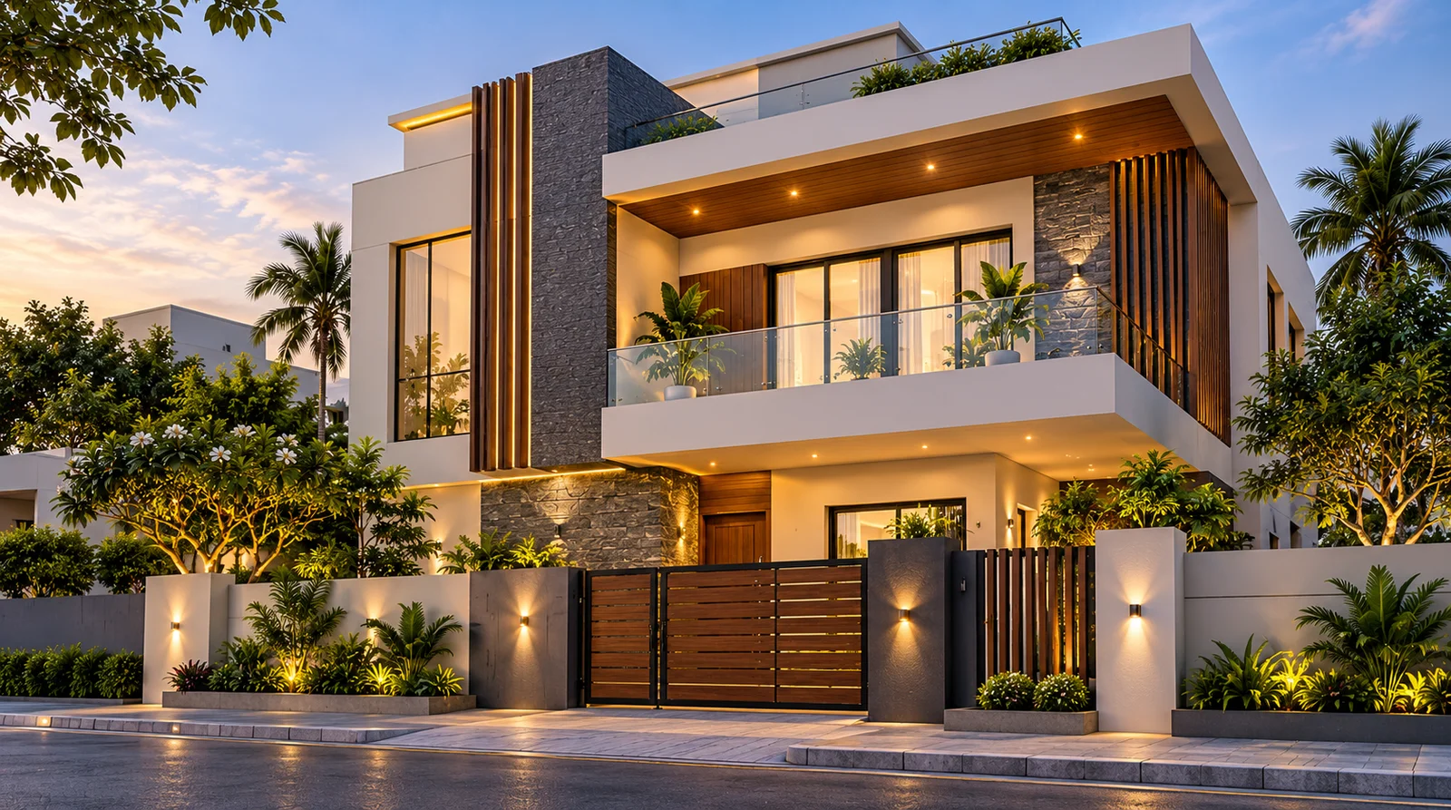
Choosing the right exterior colours can completely change the appearance of a house. A simple building can look elegant with a carefully planned palette, while an expensive facade can feel visually cluttered when too many colours compete for attention. That is why modern front elevation colour combinations are about more than choosing attractive shades. They involve balancing the building's architecture, natural light, surrounding materials, and everyday maintenance needs.
Indian homes come in many styles, from compact independent houses and duplexes to traditional bungalows and contemporary villas. Each style has different requirements. A narrow frontage may benefit from a lighter, simpler palette, while a larger elevation can accommodate contrasting accent panels and textured finishes.
Weather also matters. Dust, intense sunlight, monsoon rain, humidity, and pollution can affect how an exterior looks over time. The right colour scheme should complement the house while working with the local environment and the selected paint system.
In this guide, you will discover practical exterior colour combinations, learn how to coordinate paint with gates and windows, and understand how to test shades before committing to a complete painting project.
What Are Modern Front Elevation Colour Combinations?
A front elevation is the visible front-facing exterior of a building. Its appearance depends on architectural features such as balconies, pillars, windows, entrance doors, projections, boundary walls, and decorative surfaces.
Modern front elevation colour combinations use two or more coordinated shades to make these features look intentional. Usually, one colour covers most of the wall, a second highlights selected sections, and an optional accent adds contrast to smaller details.
For example, warm white can provide the main background, sage green can highlight a recessed wall, and charcoal can coordinate with window frames. Each shade has a role rather than competing equally for attention.
There is no single colour combination that works for every home. The most suitable choice depends on the facade's size, surrounding finishes, lighting conditions, and the homeowner's preferred style.
10 Modern Front Elevation Colour Combinations for Indian Homes
1. Ivory, Greige and Charcoal Grey
Ivory, greige, and charcoal grey create a balanced contemporary appearance. Ivory keeps the facade light, greige introduces a warmer neutral tone, and charcoal gives architectural details definition.
This combination suits modern duplexes, houses with rectangular balconies, and buildings with large windows or clean geometric lines.
How to use this palette:
- Apply ivory to the largest wall surfaces.
- Use greige on selected projections, balcony recesses, or secondary wall sections.
- Reserve charcoal for window frames, railings, or limited accent details.
If the house has a narrow frontage, keep the darker shade to a smaller area. Too much dark colour can make the facade feel visually heavy.
2. Sage Green and Warm White
Sage green is a muted, natural-looking green that pairs well with warm white. Together, the shades create a relaxed exterior without relying on bright or overpowering colours.
This combination is suitable for independent homes, garden-facing properties, and contemporary houses with simple architectural detailing.
Use warm white as the main colour and sage green on one prominent wall or recessed section. Wooden doors, natural stone, and neutral paving can complement the palette.
Before choosing a green, compare several samples. A grey-toned sage may look understated in direct sunlight but appear cooler in shade.
3. Beige and Chocolate Brown
Beige and chocolate brown create a warm, grounded appearance. The lighter shade keeps the building inviting, while brown adds depth around entrances, balcony sections, and selected architectural features.
This palette works well for homes that combine traditional materials with modern lines.
Use beige across the main facade and apply chocolate brown selectively. Coordinate the colour with wooden doors, brown window frames, or earthy stone finishes.
For a small house, avoid spreading dark brown across too many wall surfaces. A limited accent can create sufficient contrast without overwhelming the building.
4. White and Slate Grey
White and slate grey offer a clean, structured appearance. They work particularly well on contemporary facades with straight lines, projecting balconies, metal railings, and large windows.
Use white or soft off-white as the dominant colour and slate grey on selected wall panels or architectural features. Dark grey window frames can connect the different elements visually.
If pure white looks too stark in strong sunlight, consider a softer off-white. It can provide a gentler contrast with grey and may coordinate more naturally with stone or concrete-look finishes.
5. Terracotta and Cream
Terracotta brings an earthy character inspired by clay, brick, and natural soil. Cream balances its warmth and helps the exterior remain light.
This combination suits homes with textured surfaces, courtyard-inspired layouts, traditional roof forms, or natural stone details.
Use cream across most of the facade and terracotta on a feature wall or entrance section. Warm outdoor lighting can complement the overall palette.
Terracotta shades vary considerably. A muted clay colour creates a different impression from a deep reddish orange, so test the exact shade on the exterior before purchasing the full quantity.
6. Olive Green and Beige
Olive green offers a deeper, earthier alternative to sage green. Beige softens the contrast and helps the overall facade feel balanced.
This palette can suit larger independent houses, villas, and homes with landscaped surroundings.
Use beige for the main walls and olive green for selected architectural sections. Dark brown or charcoal can be introduced as a small additional accent when it complements existing doors or window frames.
Because olive green can appear quite dark in shade, review the sample in both direct sunlight and shaded areas before making a final decision.
7. Greige and Warm White
Greige combines characteristics of grey and beige, making it a useful neutral option for contemporary homes. It provides more visual depth than plain white without becoming as dominant as a strong accent colour.
This palette works well with stone cladding, glass balconies, metal railings, and simple geometric facades.
Use warm white on the main wall surfaces and greige on selected projections or recessed areas. If the building already has decorative stone or patterned tiles, keep the painted sections simple so the materials remain visually balanced.
8. Dusty Blue and Off-White
Dusty blue offers a subtle colour accent, while off-white softens the contrast. The result can feel contemporary without relying on a very bright blue.
This combination is suitable for houses with balconies, simple rooflines, and neutral exterior finishes.
Use off-white as the main colour and dusty blue on a limited number of wall sections. Avoid dividing every floor into alternating blue and white panels unless the architecture supports that design.
Check the colours against the gate, windows, and surrounding landscape. Blue tones can look different depending on natural light and nearby surfaces.
9. Sand Beige and Dark Brown
Sand beige and dark brown create a natural, understated palette. They coordinate well with wooden doors, stone features, and earthy paving.
This combination is useful for homeowners who want a sophisticated exterior without introducing several competing colours.
Apply sand beige to the main walls and use dark brown around the entrance or on selected architectural details. For a compact facade, keep the darker areas limited so the building retains a balanced appearance.
10. Light Grey and Muted Blue-Grey
Light grey paired with muted blue-grey creates a cool, modern appearance. It suits buildings with contemporary windows, metal railings, and clean-lined balconies.
Use light grey as the main colour and blue-grey as a supporting shade. If the house already has dark window frames or a charcoal gate, coordinate the accent carefully rather than introducing another strong colour.
Review the samples in morning and afternoon light. Cool shades may appear noticeably different depending on the direction of sunlight and the amount of shade around the building.
How to Choose the Best Exterior Colours for Your House
Consider the Architecture First
Begin by identifying the building's strongest features. A house with projecting balconies, straight horizontal lines, and large windows may look best with a restrained palette. A traditional elevation with decorative pillars or arches may suit warmer shades and softer contrasts.
Use colour to support the architecture instead of competing with it. If the facade already includes stone cladding, exposed brick, or patterned tiles, fewer paint colours may create a more cohesive result.
Consider Sunlight and House Orientation
Natural light affects how exterior colours appear throughout the day. Direct sunlight can make many shades look lighter, while shaded walls may appear darker or cooler.
North-facing and heavily shaded walls deserve particular attention because some whites and greys can look cooler in low light. South- and west-facing walls may receive substantial direct sunlight, depending on the location and surrounding buildings.
Do not make the final choice using a digital photograph alone. Test the actual paint shades on the exterior and observe them at different times.
When comparing exterior shades, consider your home's architectural style, surrounding materials and natural lighting. For additional guidance on choosing coordinated colours, consult the Asian Paints Colour Selection Guide before finalising your palette.
Match the Gate, Windows and Roof
The facade should coordinate with the materials that will remain in place after painting.
- Black or charcoal frames can complement ivory, greige, and warm white.
- Wooden doors can work well with beige, cream, terracotta, and earthy greens.
- Grey stone features can pair with white, muted blue-grey, or greige.
- Red or brown roof tiles can complement cream, sand beige, and warm earthy colours.
If the gate already has a strong colour, use it as a starting point for the palette rather than choosing the wall colours in isolation.
If your front elevation includes a balcony, porch or other outdoor area, coordinate its finish with the main facade for a consistent look. Our Guide to Painting Balconies and Outdoor Spaces offers additional ideas about colour choices and weather-resistant finishes.
Keep the Number of Colours Under Control
For many contemporary homes, two main colours and one small accent are a useful starting point. One colour covers the main facade, another highlights selected areas, and the optional accent defines smaller features.
This is a design guideline, not a strict formula. A minimalist building may look best with only two shades, while a larger facade with several architectural materials may require a different balance.
Test the Colours Before Buying Paint
Paint samples can prevent expensive mistakes. A shade that looks attractive on a small card may feel too strong when applied across a large wall.
Follow these steps:
- Shortlist two or three combinations that suit your building.
- Obtain physical samples from the paint manufacturer.
- Apply sample patches to representative exterior areas.
- Observe them in direct sunlight and shade.
- Compare them with the gate, window frames, roof, and surrounding finishes.
- Confirm the final shades and product specifications before ordering the full quantity.
For larger homes, review the samples from the street as well as from close range. The overall balance may look different from a normal viewing distance.
Before finalising your colour palette, it is also important to choose an exterior paint system that suits your wall surface and local weather conditions. Read our Complete Guide to Choosing Exterior Wall Paint for Indian Homes to understand the factors to consider before starting your project.
Best Exterior Paint Colours for Different Indian Climates
India's climate varies significantly by region. The right exterior coating depends on the surface, weather exposure, and condition of the building, not just the selected colour.
Hot and Sunny Locations
Ivory, cream, sand beige, and pale greige are options to consider when a light exterior appearance is preferred. Light colours can reflect more sunlight than comparable dark colours, although actual surface temperature also depends on the coating, wall construction, insulation, and exposure.
For strongly sun-exposed walls, select an exterior coating suitable for the substrate and local conditions. Follow the manufacturer's instructions for preparation and application.
Dusty and Urban Locations
Medium beige, greige, warm grey, and some earthy shades can make ordinary dust less noticeable than it might be on certain very dark or very bright surfaces.
However, colour alone cannot prevent pollution or staining. Wall texture, traffic exposure, rainfall, and cleaning practices also affect how clean the facade looks over time.
Rainy and Humid Locations
In areas with heavy rainfall or humidity, pay attention to cracks, water entry, drainage, dampness, and surface preparation before painting.
Choose a suitable exterior paint system and follow the manufacturer's recommendations. Painting over unresolved dampness can contribute to premature coating failure regardless of the colour selected.
Exterior walls in India may be exposed to intense sunlight, dust and monsoon rain. Along with choosing a suitable colour, proper surface preparation and an appropriate coating system can help protect the painted surface. Read our Exterior Wall Painting Guide for Monsoon, Heat and Fading Protection for more practical guidance.
Coastal Locations
Coastal homes may experience moisture and salt exposure. The right protective system depends on the wall material, exposure level, and condition of the existing surface.
Metal gates and railings may need a suitable protective coating system rather than a decorative topcoat alone. Check the product specifications before selecting the system.
Exterior Paint Colours That Can Help Hide Dust
Homeowners often want a colour that looks clean for longer between washes. Medium-toned beige, greige, warm grey, and selected earthy shades can be practical options because everyday dust may be less noticeable against them.
Very dark colours can show pale dust or mineral deposits, while very light colours may reveal mud splashes and pollution staining. The result depends on the local environment and the surface finish.
Colour should not replace proper surface preparation or product selection. A suitable exterior coating, correctly prepared walls, and appropriate maintenance are important for long-term appearance.
If you would like to compare more facade styles before selecting your final combination, explore these Exterior Paint Colour Inspiration Ideas. Use them as references, then test suitable shades on your own home's walls because lighting and existing materials can change how colours appear.
Common Mistakes to Avoid When Choosing House Exterior Colours
Choosing Colours Only From Online Pictures
Online photographs may be edited, photographed under different lighting, or displayed on screens with inaccurate colour settings. Always compare physical samples before deciding.
Using Too Much Contrast
Several dark colours across different wall sections can make the facade feel fragmented. Start with a dominant shade, a complementary colour, and a limited accent.
Ignoring Existing Materials
Stone cladding, exposed brick, roof tiles, metal frames, and paving all affect the final result. Coordinate the palette with these fixed features before purchasing paint.
Skipping Surface Preparation
Dust, loose paint, damaged plaster, efflorescence, and unresolved dampness can affect adhesion and durability. Inspect and prepare the surface according to the coating manufacturer's instructions.
Choosing Paint Without Checking Its Intended Use
Different exterior coatings have different application requirements and suitable uses. Review the technical data sheet, recommended coverage, drying conditions, and recoat instructions before starting the project.
Frequently Asked Questions
Which colour combination is best for a modern Indian house exterior?
Ivory with charcoal, warm white with sage green, beige with brown, and greige with white are useful options to consider. The best choice depends on the architecture, natural light, existing materials, and surrounding environment.
Which exterior paint colours make a house look modern?
Warm neutrals, muted greens, earthy browns, soft greys, and carefully selected blue-grey shades can complement modern architecture. Simple and balanced colour placement often matters as much as the individual shades.
Are light exterior colours better for hot climates?
Light colours can reflect more sunlight than comparable dark colours, depending on the coating and surface properties. Indoor comfort also depends on insulation, roof design, wall construction, ventilation, and window exposure.
Which house exterior colours hide dust better?
Medium beige, greige, warm grey, and some earthy shades can make ordinary dust less noticeable. No colour prevents staining, so maintenance and coating quality remain important.
How many colours should I use on a front elevation?
Two main colours and one limited accent are a useful starting point for many modern homes. Simpler buildings may look better with fewer colours, while detailed facades may need a different arrangement.
Should the boundary wall match the house exterior?
The boundary wall should coordinate with the main facade but does not need to be an exact match. A lighter neutral with a small accent can create a consistent appearance without making every surface identical.
How do I choose between matte and glossy exterior paint?
The appropriate finish depends on the product, surface condition, desired appearance, and maintenance needs. Follow the manufacturer's recommendations for the specific exterior surface and coating system.
How often should exterior house paint be renewed?
There is no single repainting interval that suits every home. Sunlight, rainfall, pollution, surface preparation, coating quality, and maintenance all influence service life. Inspect the walls for fading, peeling, cracks, dampness, and other signs of deterioration.
Final Thoughts
Modern front elevation colour combinations for Indian homes should balance appearance, architecture, and practical performance. Ivory and charcoal can create a crisp contemporary facade, sage green and warm white can introduce a natural character, and beige with chocolate brown can provide a warm, understated look.
Before making a final decision, consider the house's exposure to sunlight, local weather, existing materials, and maintenance requirements. Test shortlisted shades on the actual building and choose a suitable exterior coating system.
A carefully planned palette can help a house look cohesive and welcoming without relying on excessive colours or complicated design features.
Planning an exterior painting project? Explore Zorvanta's relevant exterior paint and coating products, and check the product specifications to choose a system suited to your surface and local conditions.
Frequently Asked Questions
Need help choosing the right finish?
Talk to our team or request a tailored quotation for your project.